Birdie Bar ↗
Brendinq / Identity / Brandbook
Fitness brands tend to shout. Dream Body Athletic Club & Spa needed the opposite: calm that still reads as strength. Nature-inspired colour and refined brand elements hold fitness, recovery and self-care in one system, placing Dream Body as a premium wellness destination.
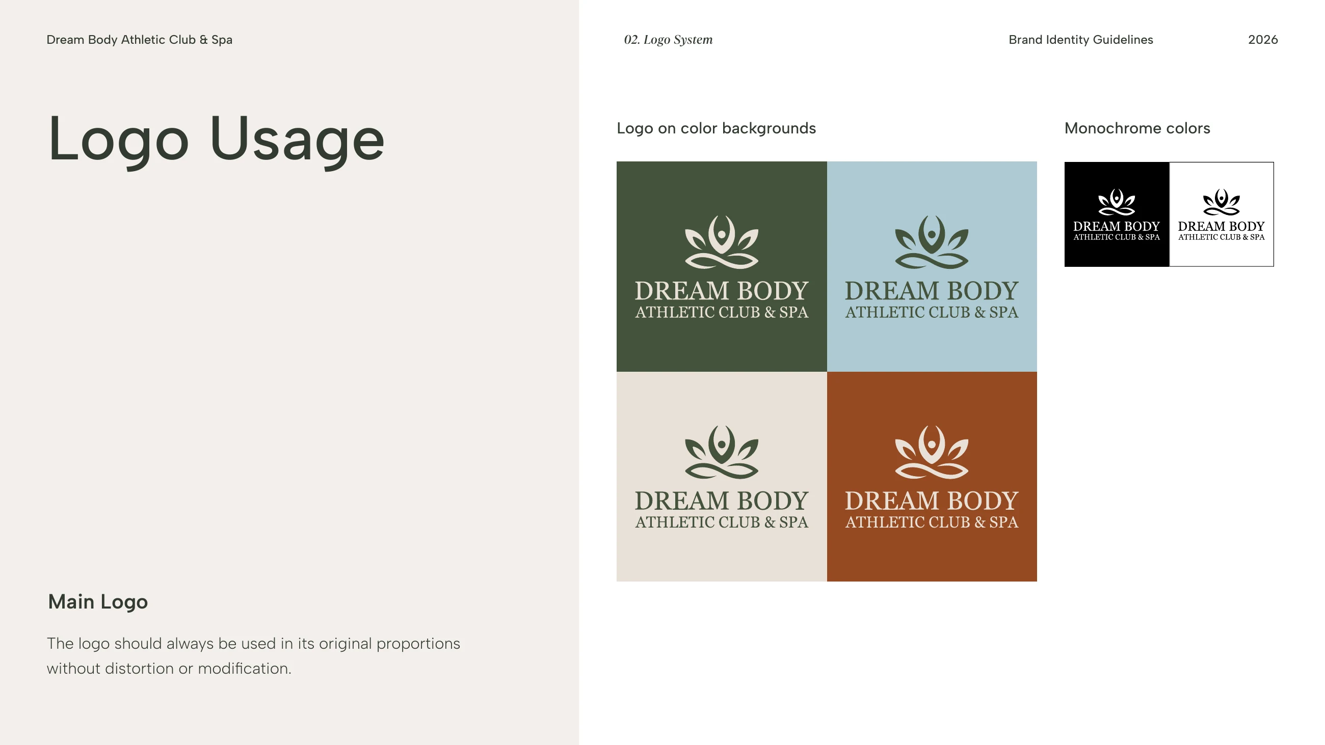
The symbol draws a person in a calm pose, rising out of leaves and water. It works with the name or on its own, in four colours and in black and white.
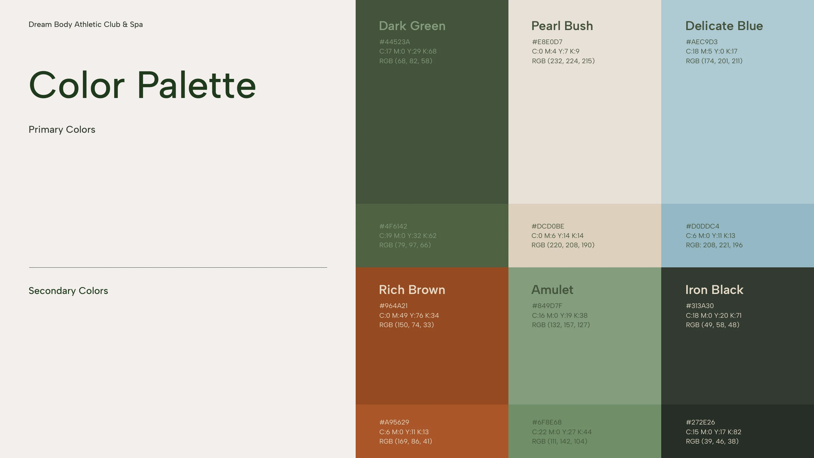
Dark Green, Pearl Bush and Delicate Blue lead, with Rich Brown and Iron Black in support.
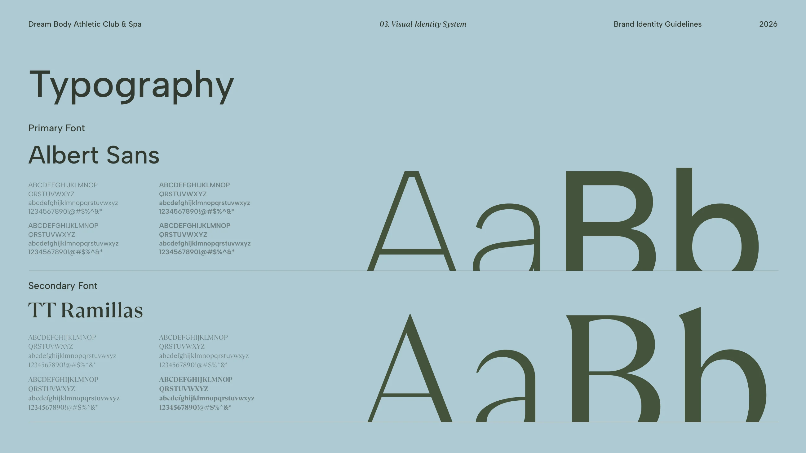
Albert Sans for everyday text, TT Ramillas for the name and the headlines.
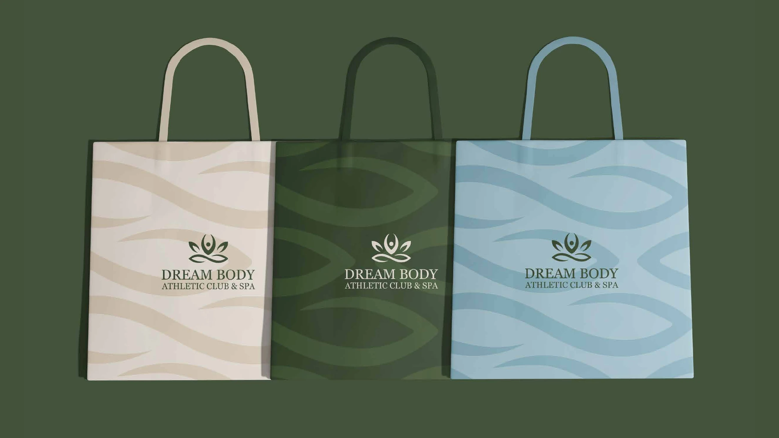
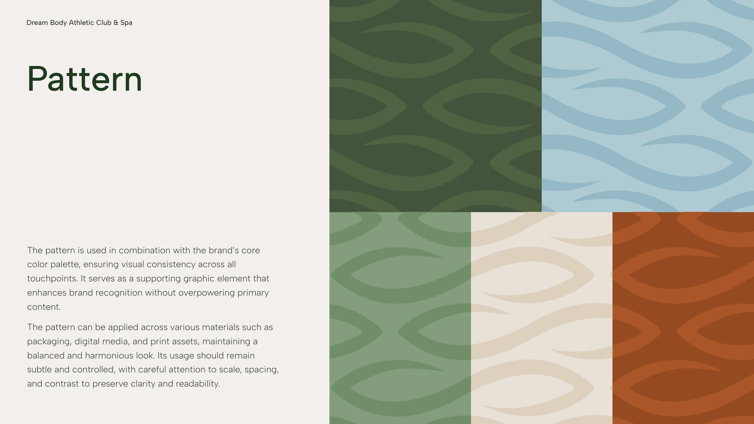
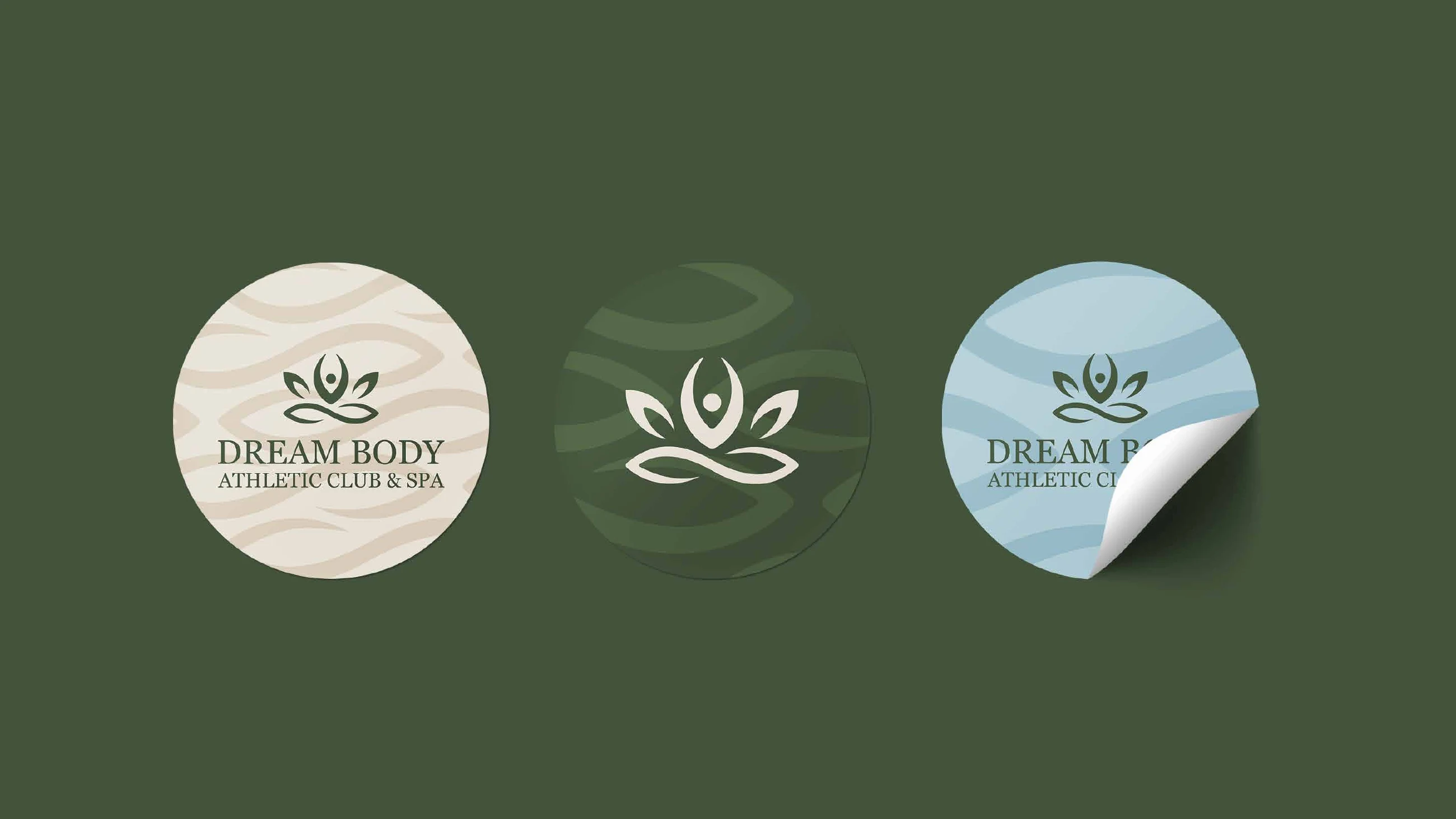
Soft waves drawn from the lines of the symbol, used quietly behind the brand on print, packaging and screens.
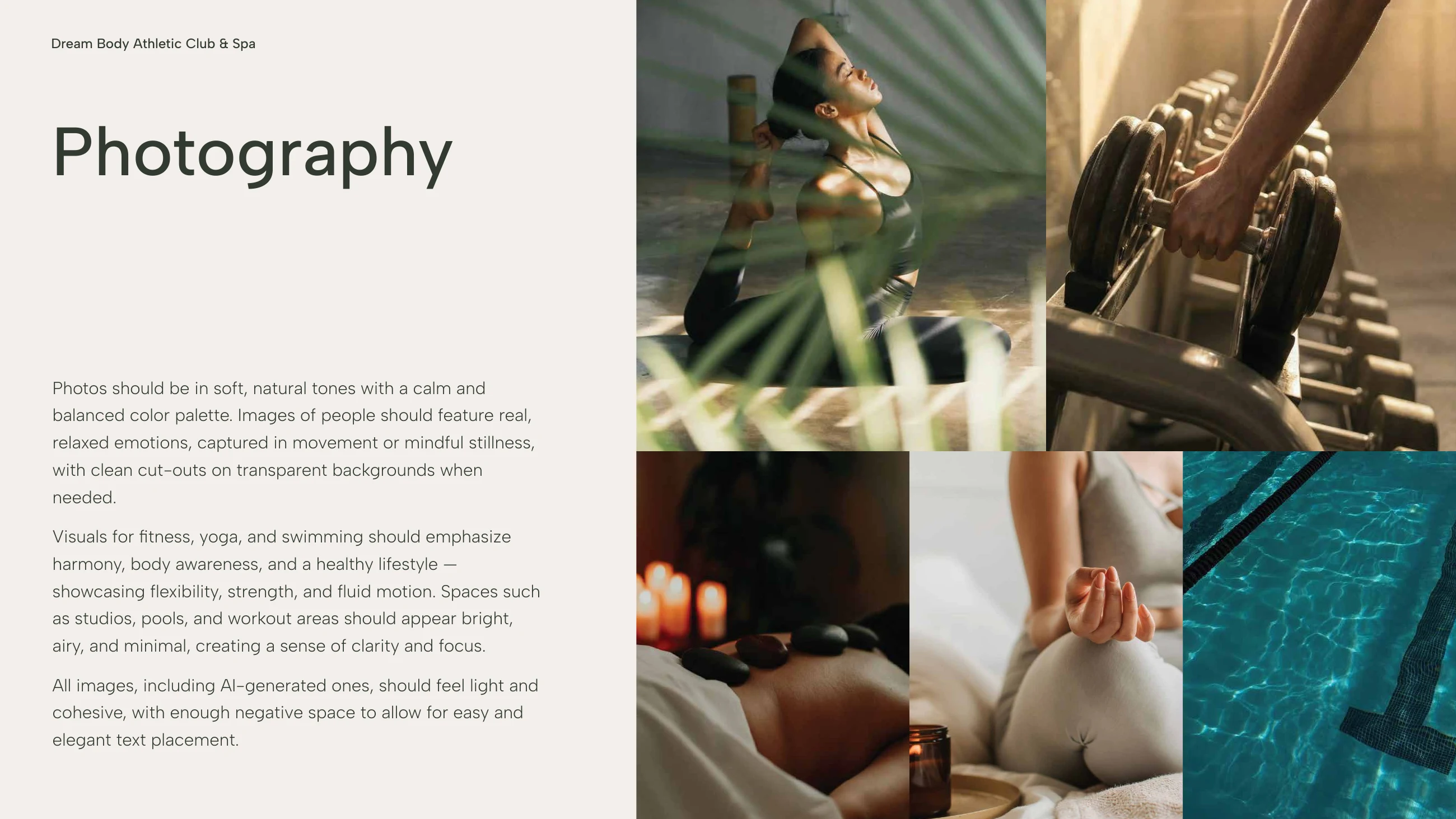
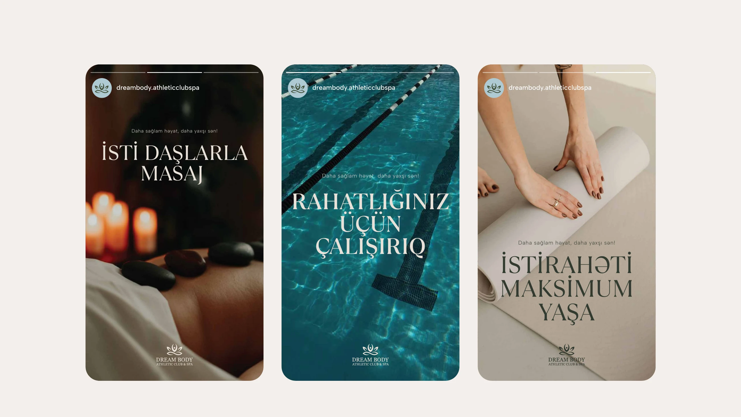
Training, the pool and the spa, photographed in natural light rather than studio gloss.
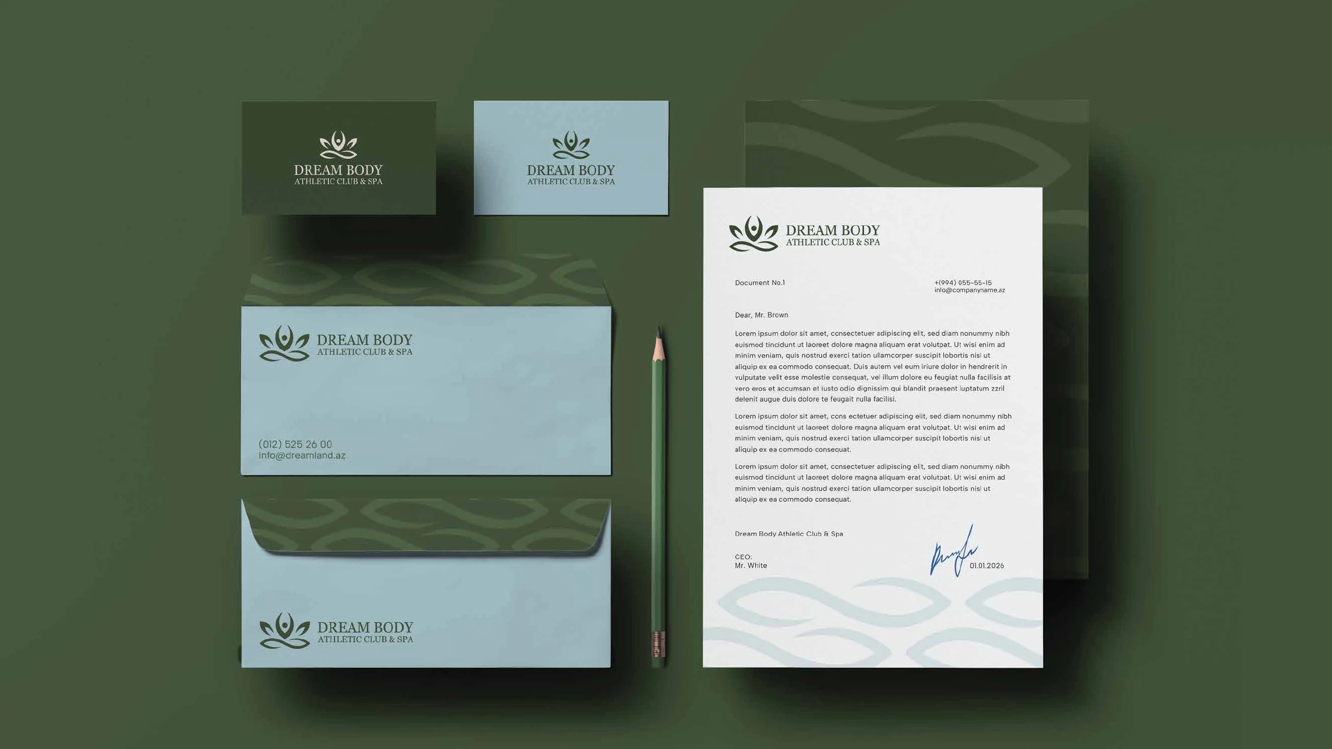
Letterhead, envelopes and business cards in the brand greens and blues.
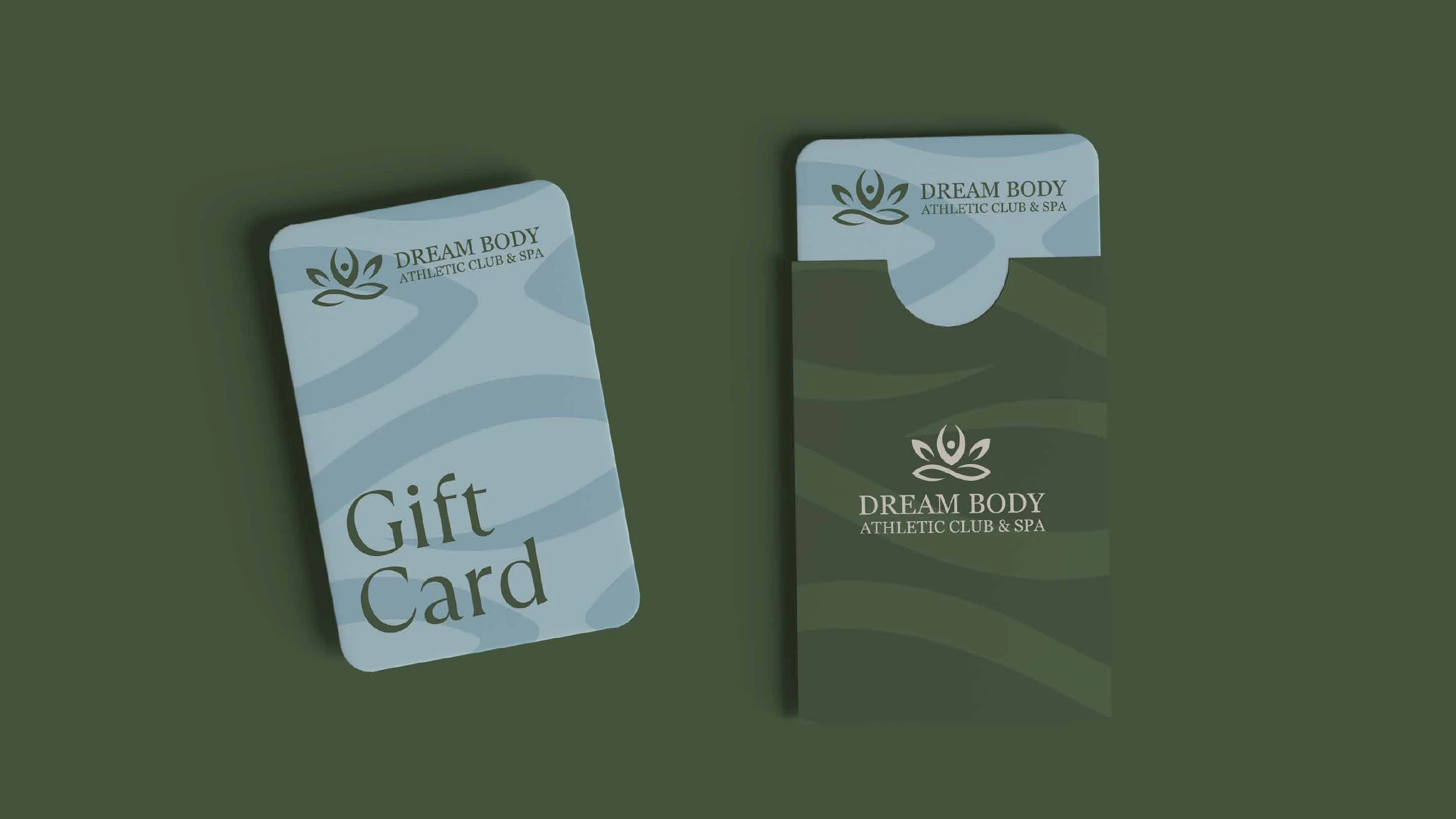
A pale blue gift card slides out of a green sleeve printed with the wave pattern.
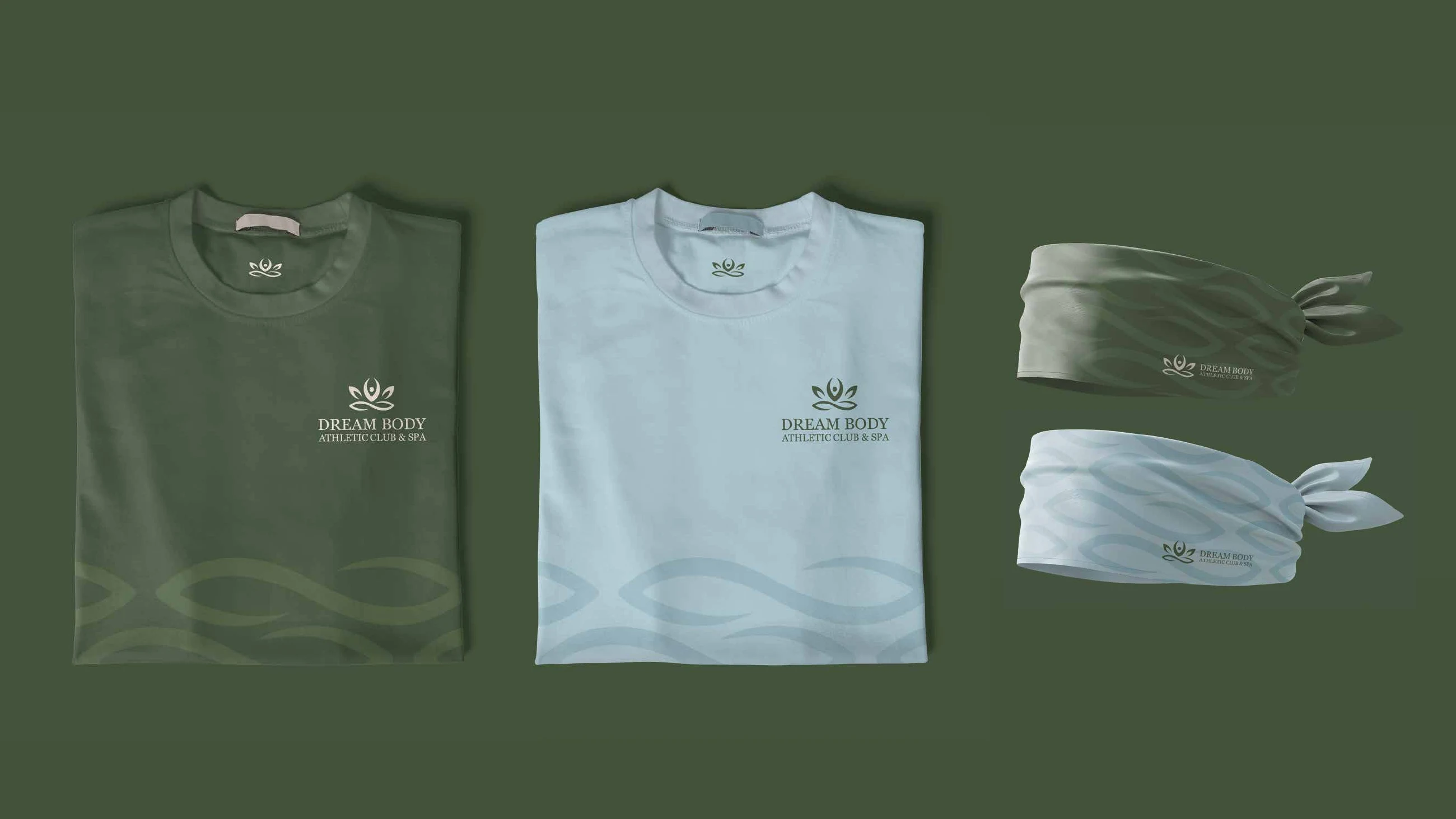
T-shirts and headbands in green and pale blue, the wave pattern low and quiet.
Posts built on the photography and the serif, in Azerbaijani.
Yalnız saytın işləməsi üçün lazım olanları saxlayırıq. İcazə versəniz, saytı yaxşılaşdırmaq üçün ondan necə istifadə edildiyini də ölçmək istərdik. Kuki siyasətini oxuyun.