Kaşıbeyaz ↗
Branding / Identity / Packaging
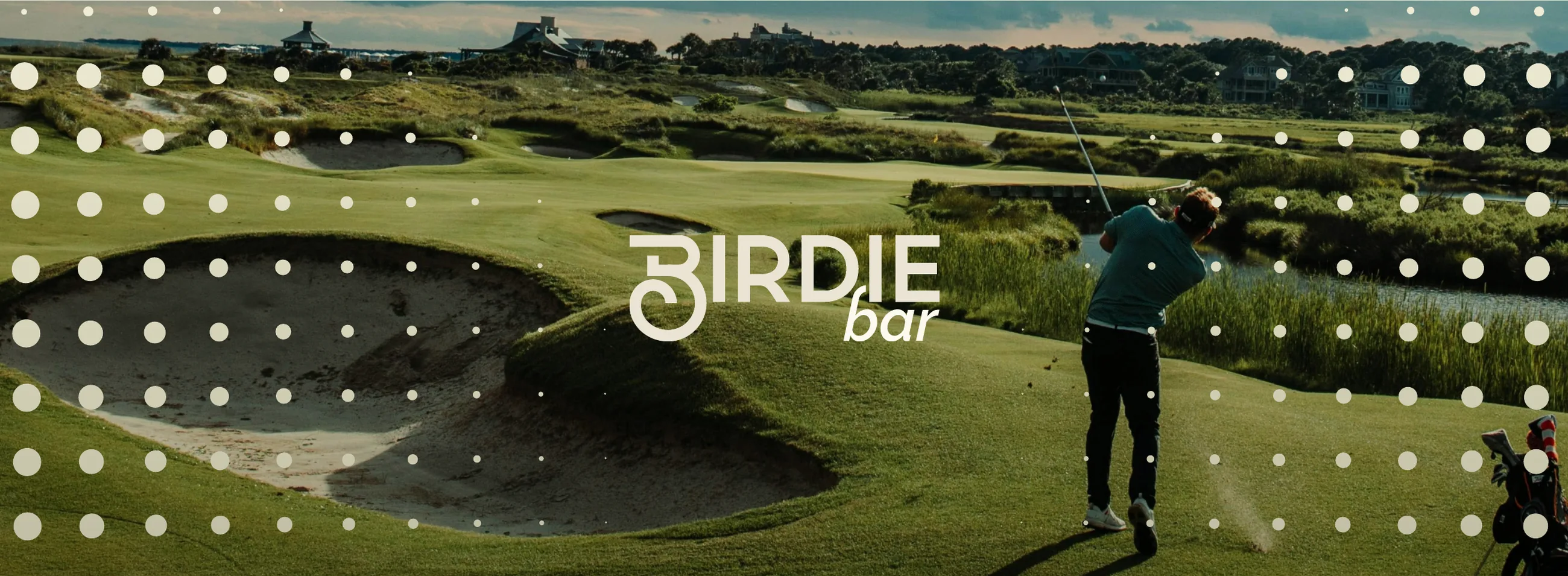
Birdie Bar borrows the language of golf and turns it into hospitality. A restrained palette, clean type and a memorable logo system keep the brand premium without making it precious, and the visual language holds up on signage, barware, menus and merchandise alike.
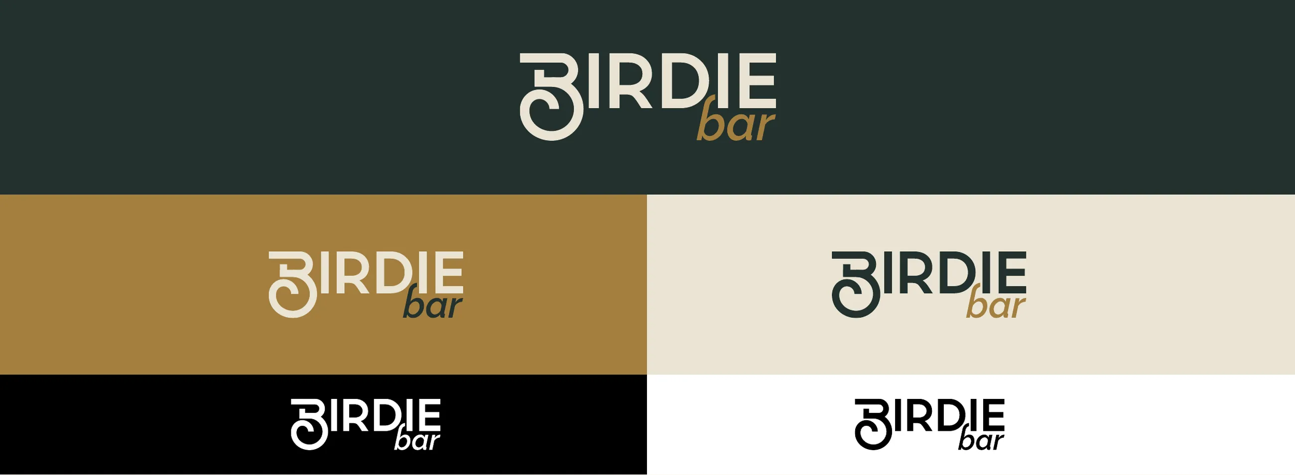
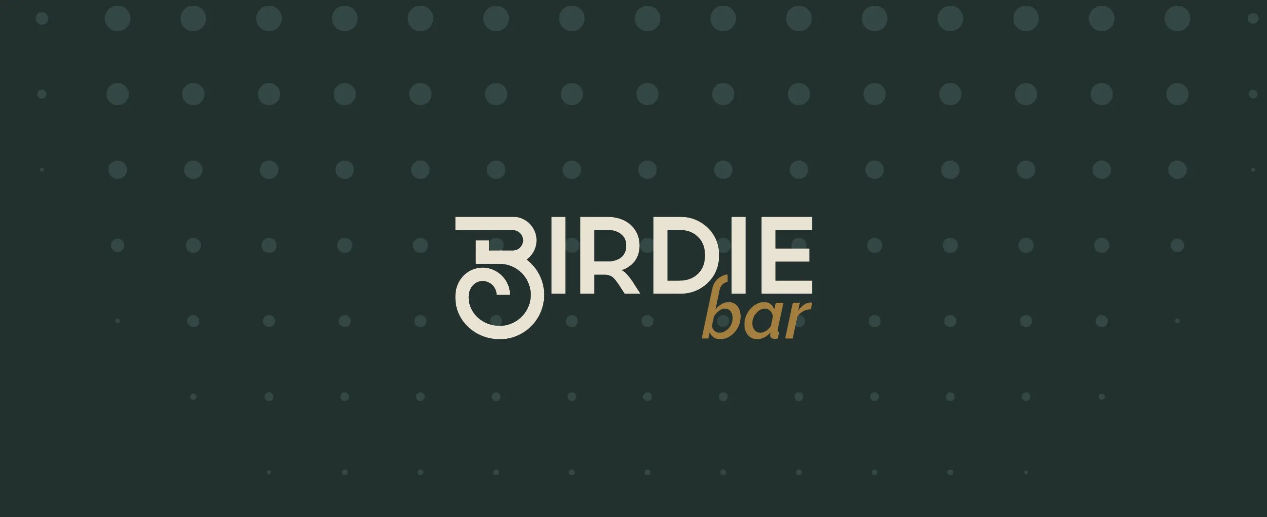
The logotype is built on a fixed 1:3 proportion. Its B curls like a golf swing, and the word bar sits beneath it in italic. Cream and sand on dark green first, monochrome where colour is not possible.
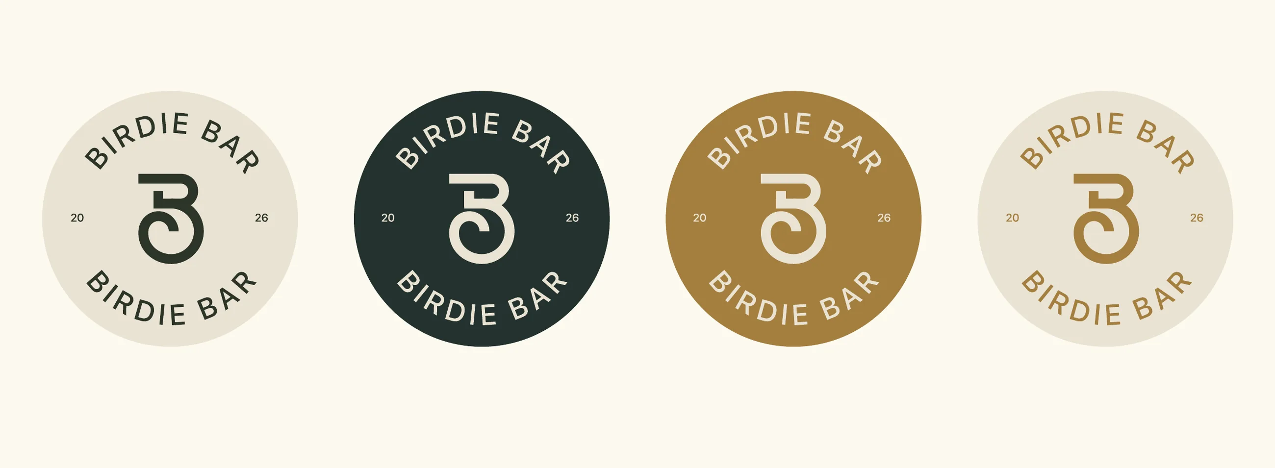
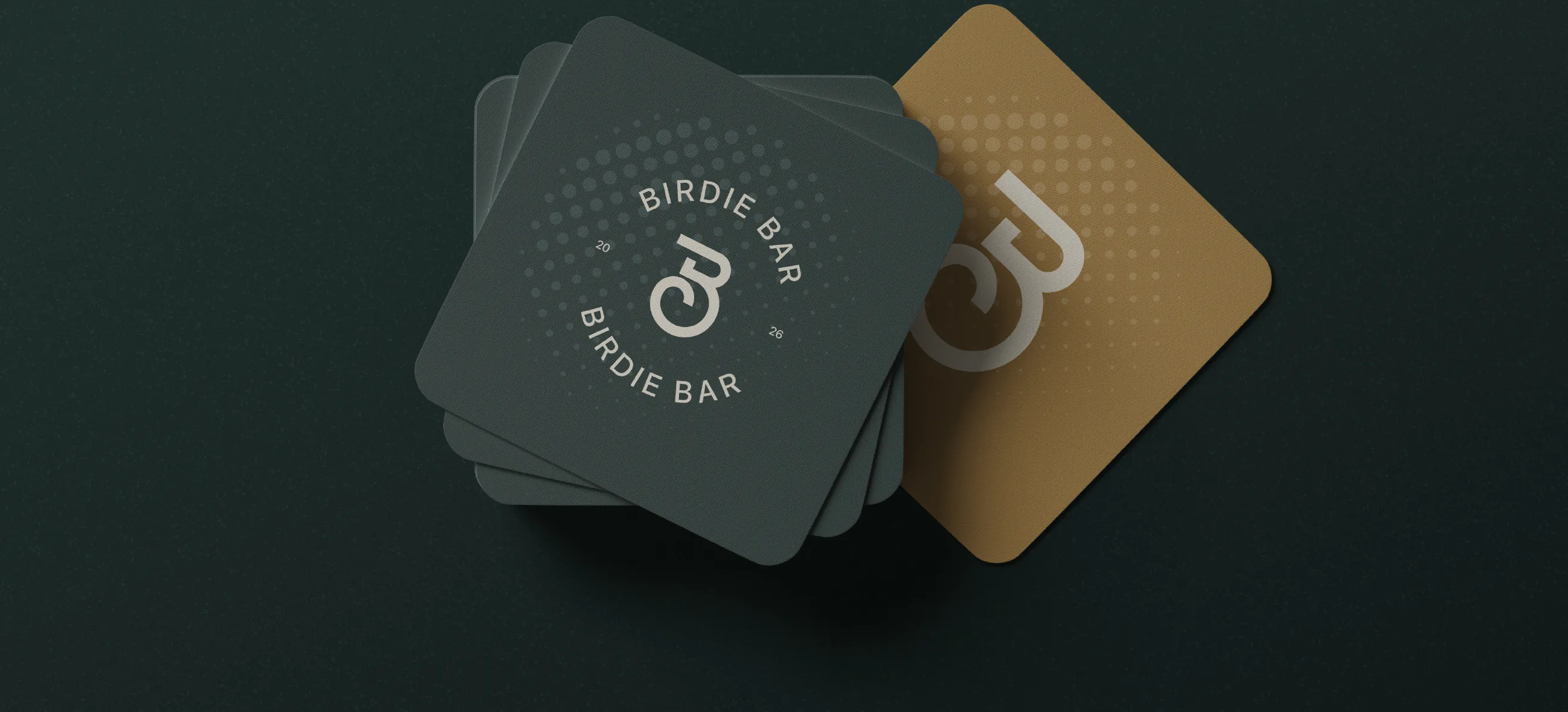
The first letter of the logotype stands on its own as a seal, a watermark and a texture.
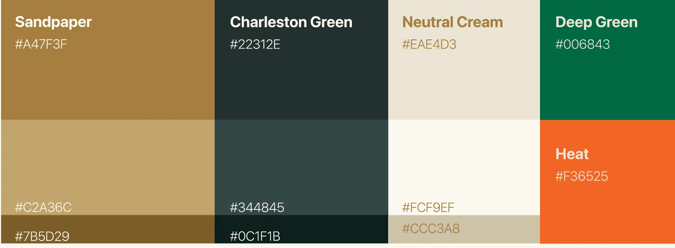
Warm, earthy tones with a dark green for depth. Deep Green and Heat orange are kept for accents.
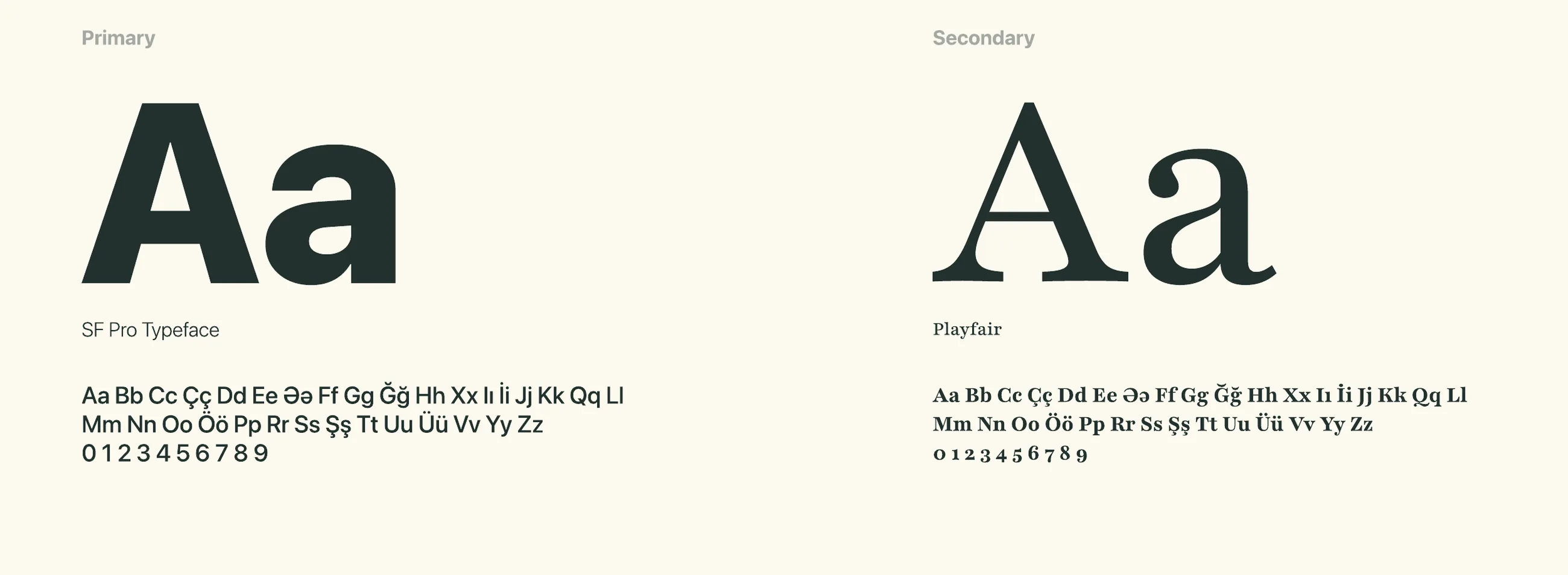
SF Pro carries every communication. Playfair appears selectively in headlines for a touch of elegance.
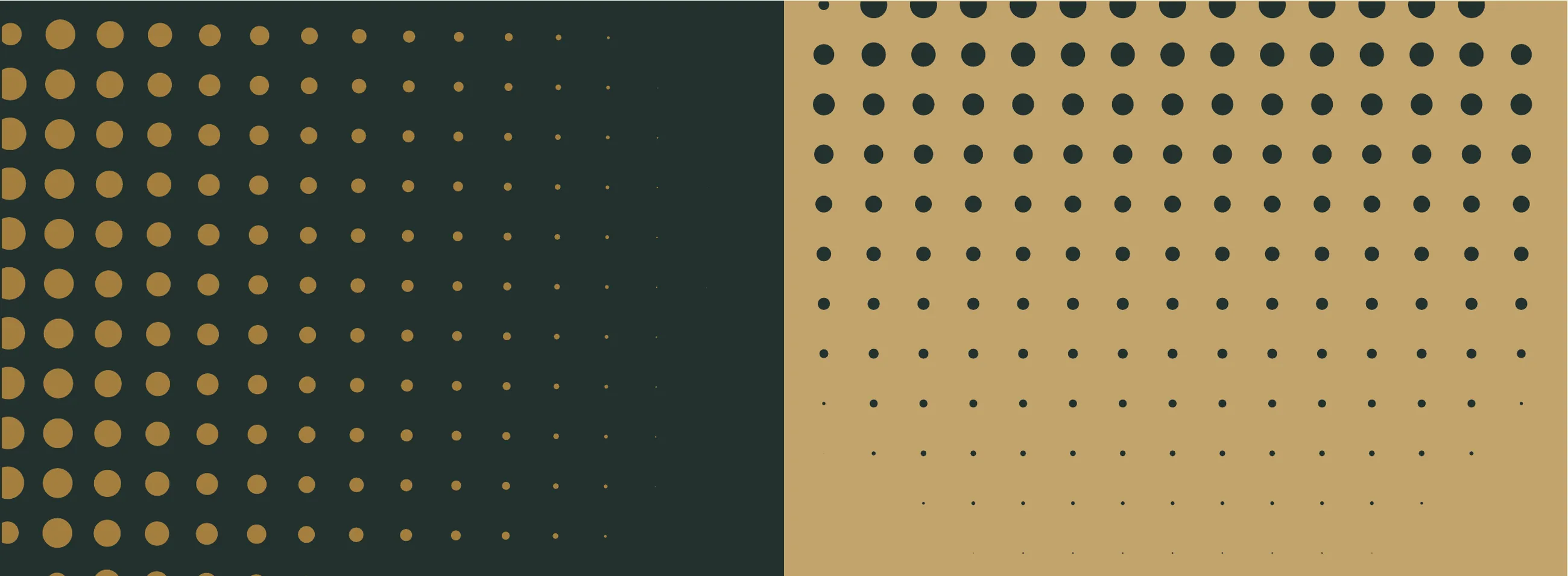
Shaded dots of varying size and density, taken from the texture of a golf ball, give the brand depth and a sense of movement.
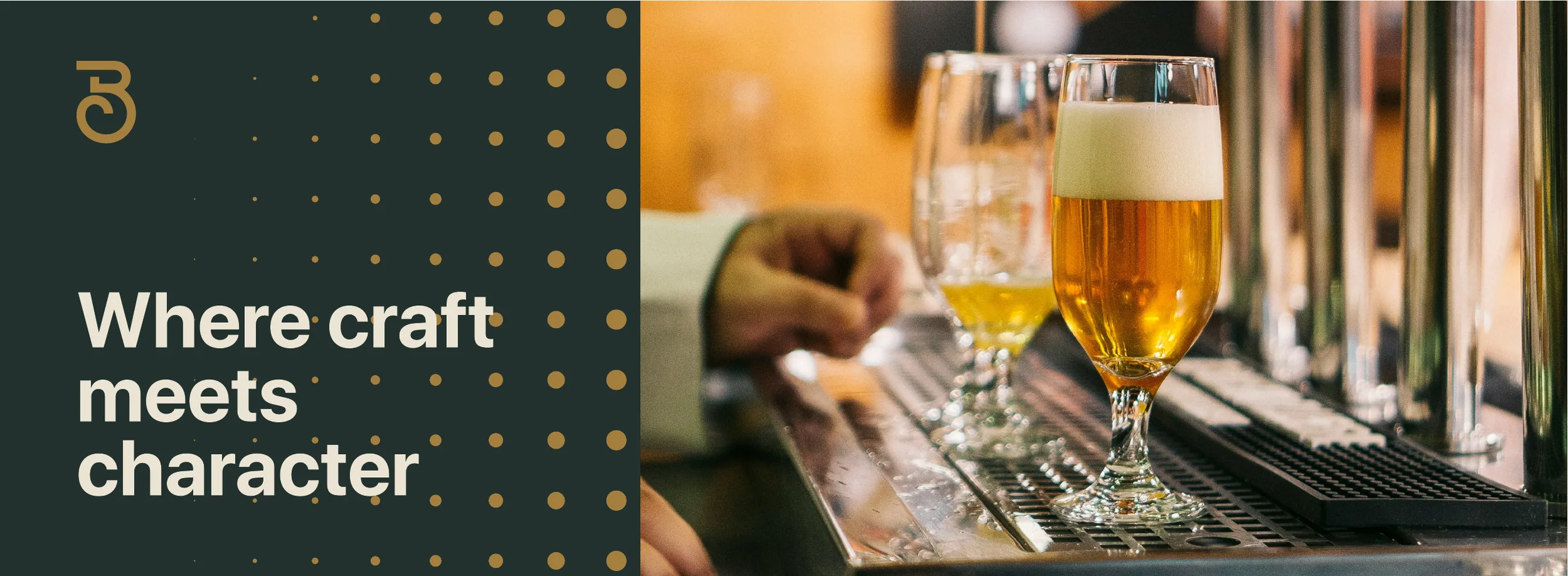
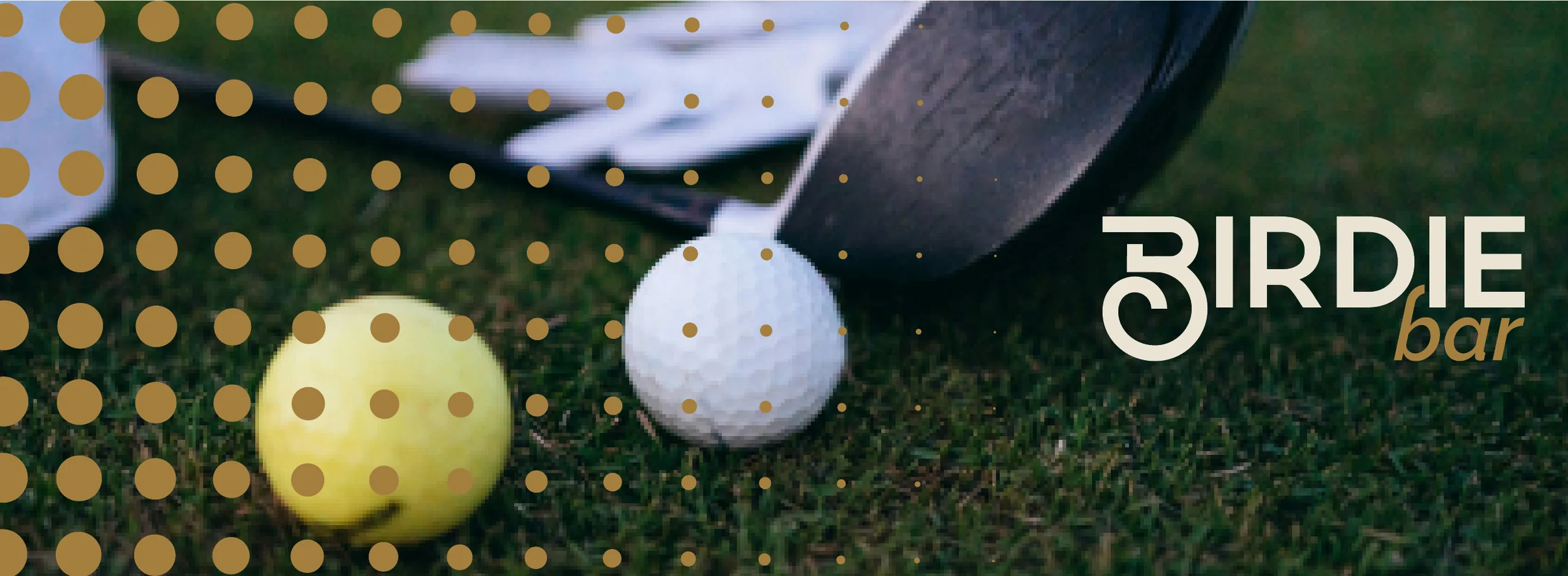
The pattern works as a frame for photography, from the bar to the course.
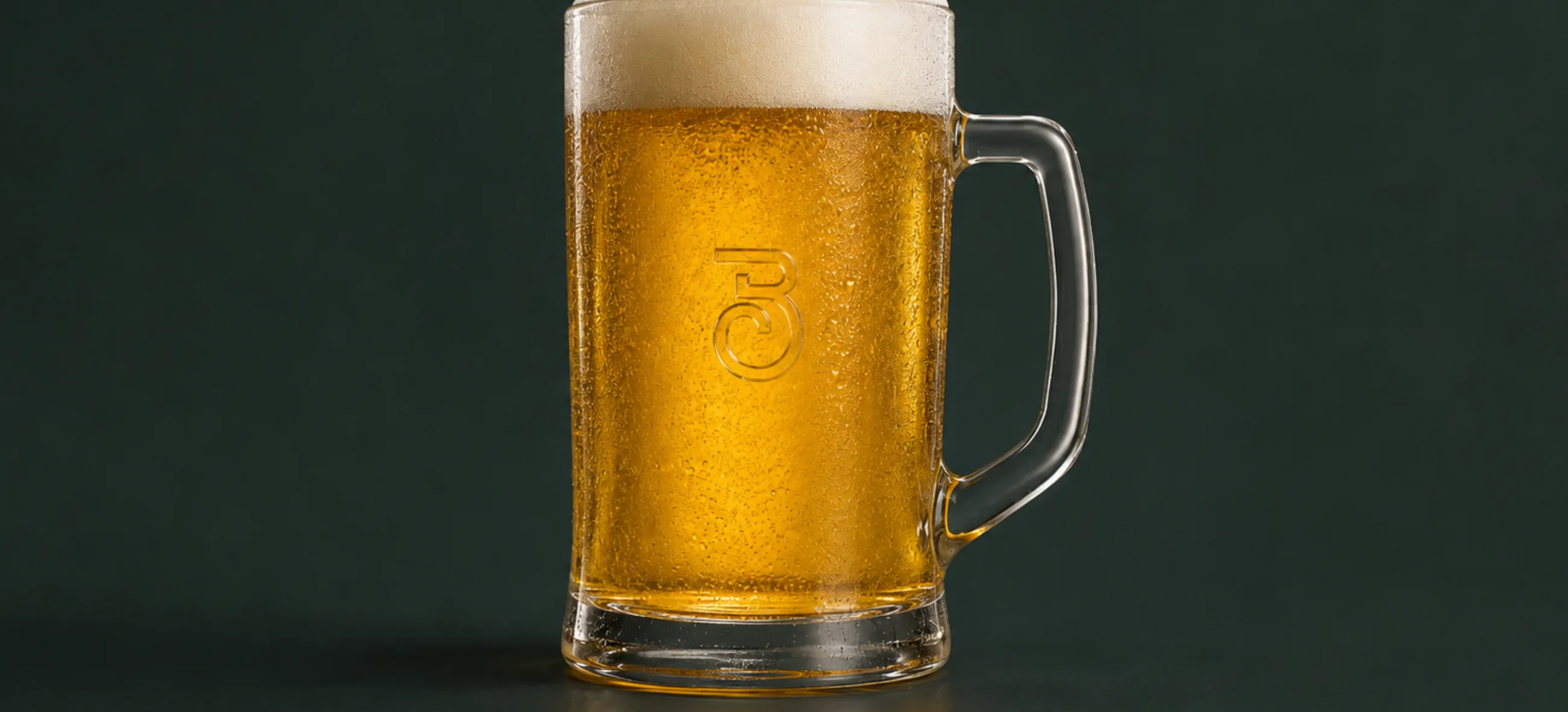
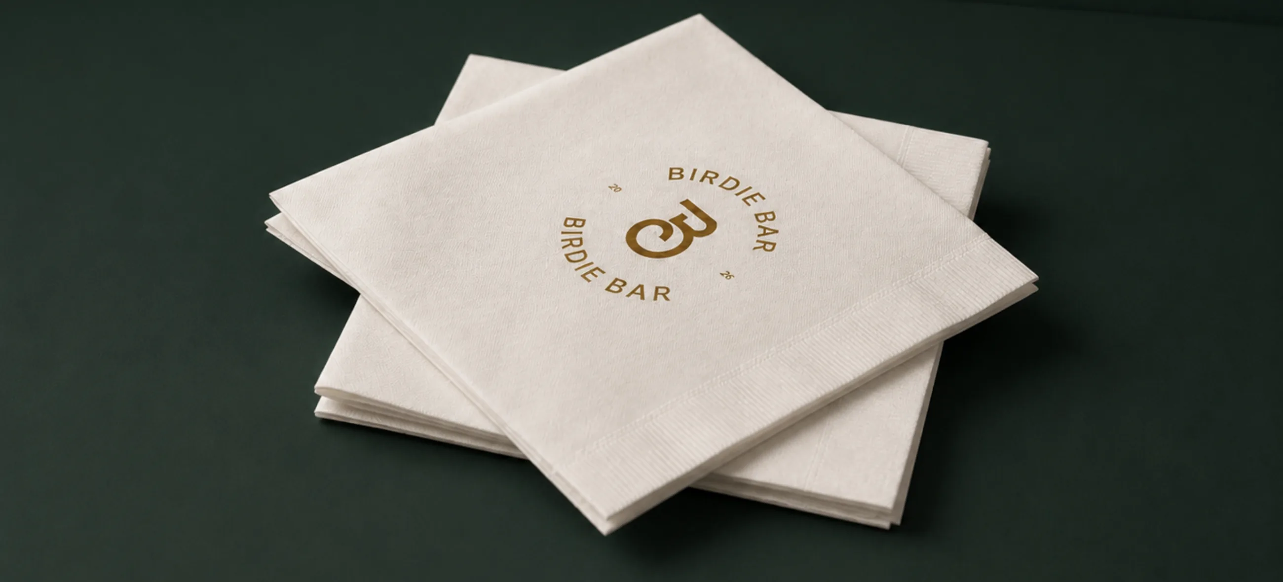
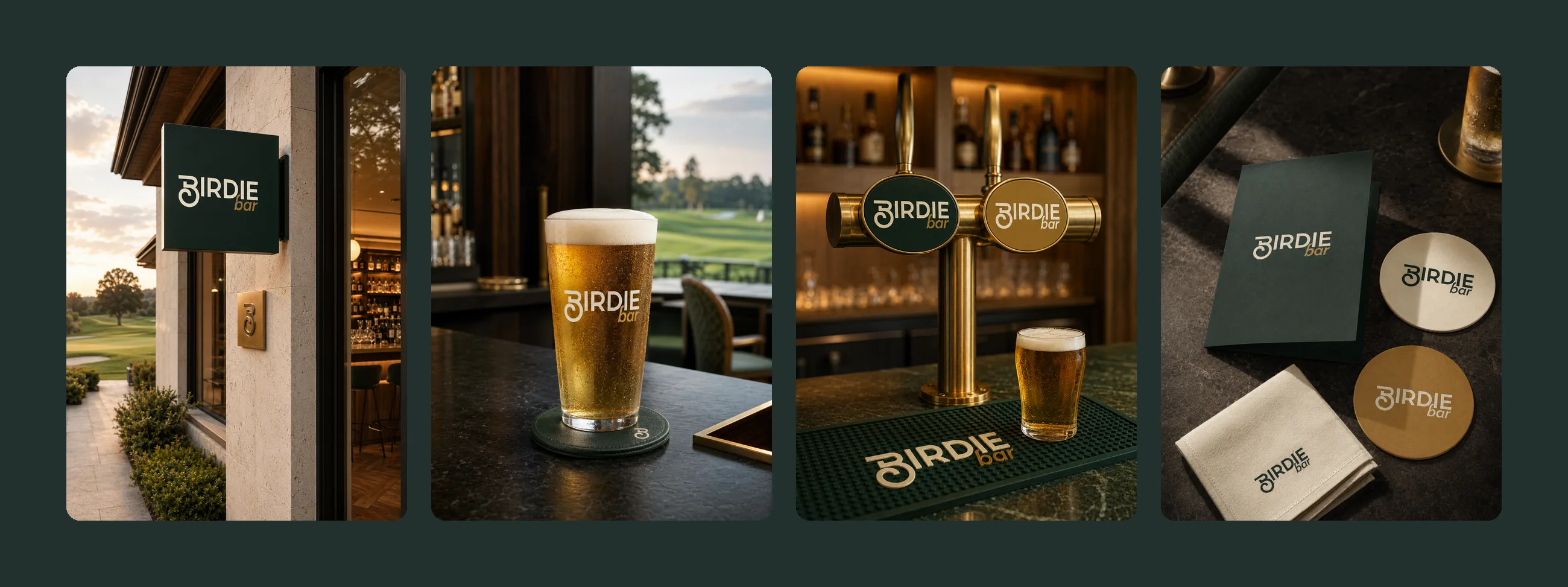
Coasters, glassware and napkins carry the seal and the monogram.
A cube sign in green and sand, pointing the way from Dreamland Golf Club.
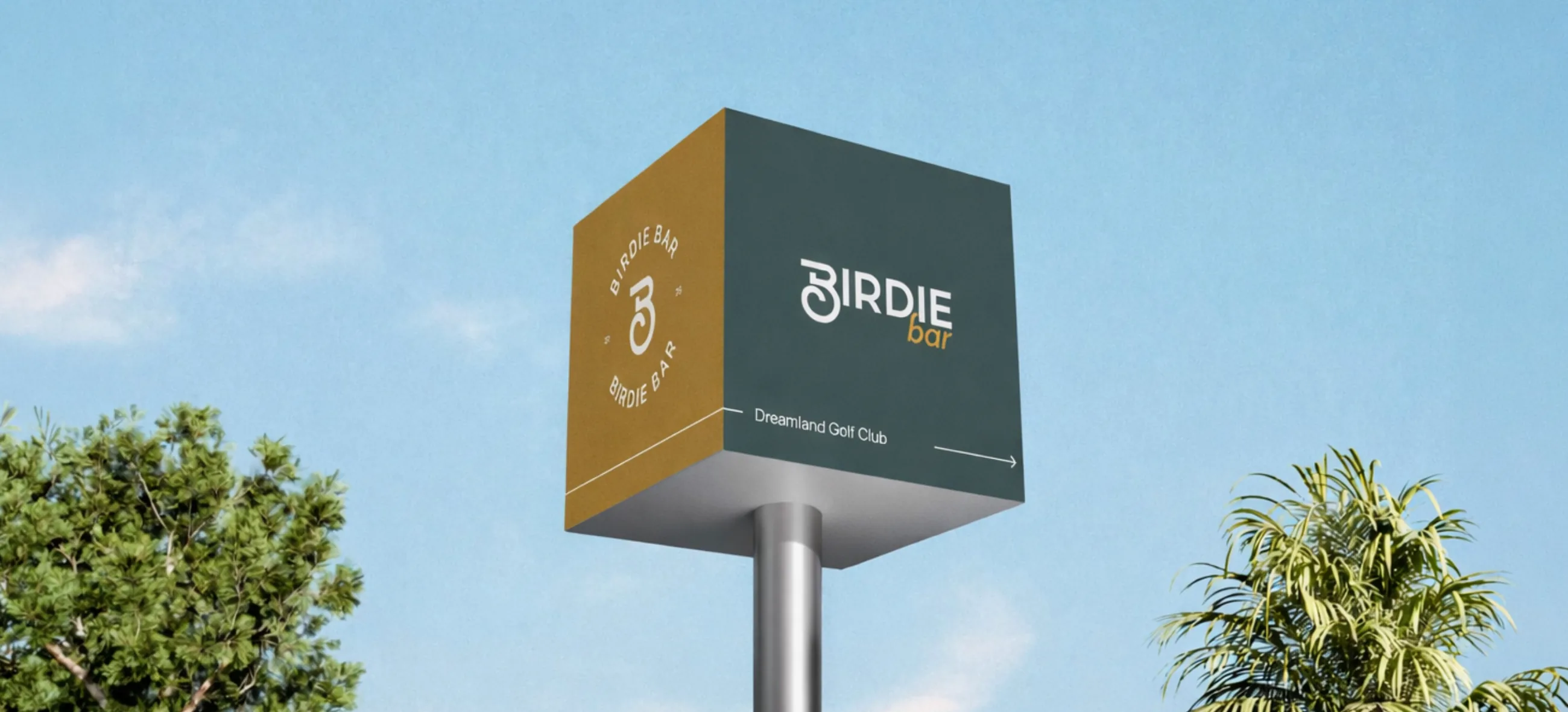
The sign at the door, a branded pint, the taps and the bar mat, the menu and the coasters.
We only set what the site needs to work. With your permission we would also like to measure how the site is used, so we can make it better. Read the cookie policy.