
Dolabs ↗
Brendinq / Identity / Social / UI/UX
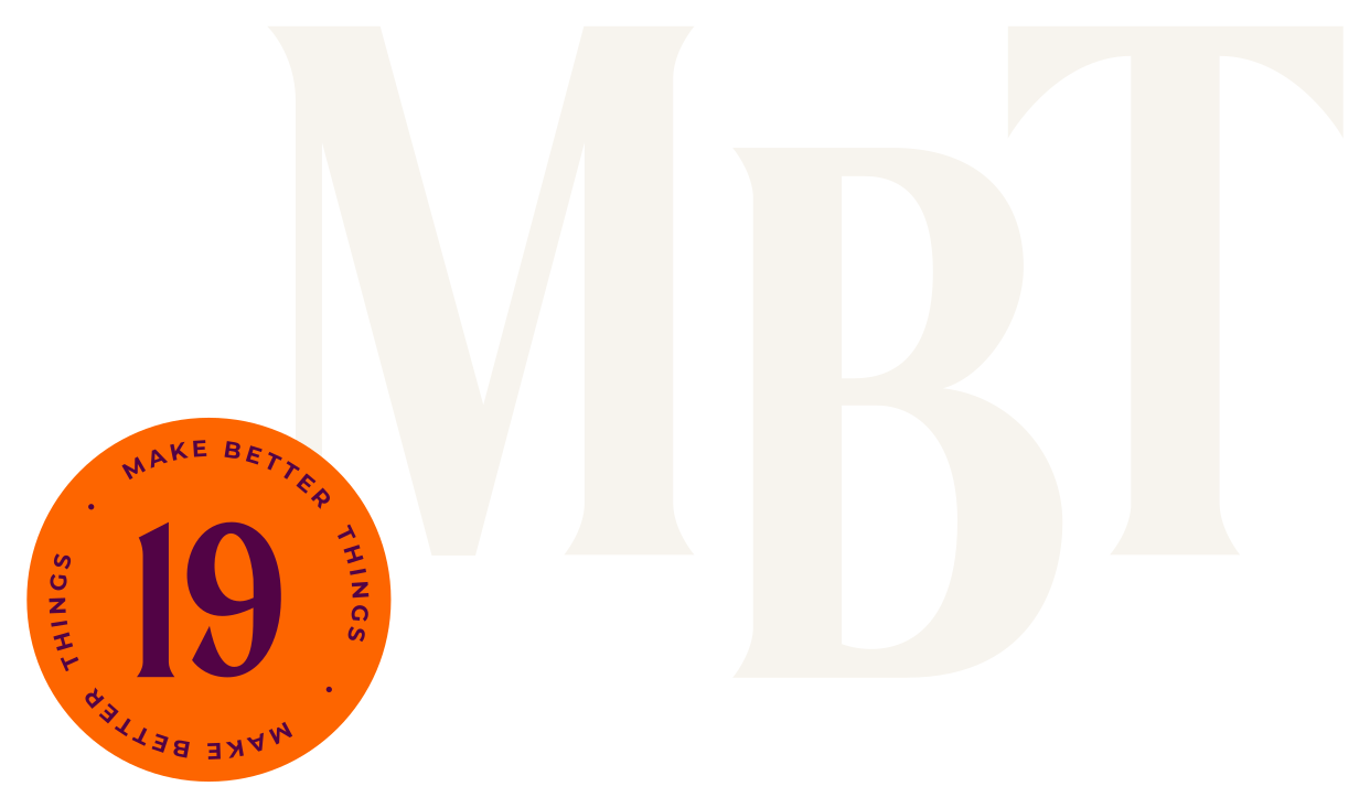
A new identity and website for MilliKart, the national payment card system of Azerbaijan. A modern, corporate visual system built on the company's own values, innovation, teamwork and sustainable development, carried from a business card to the website.
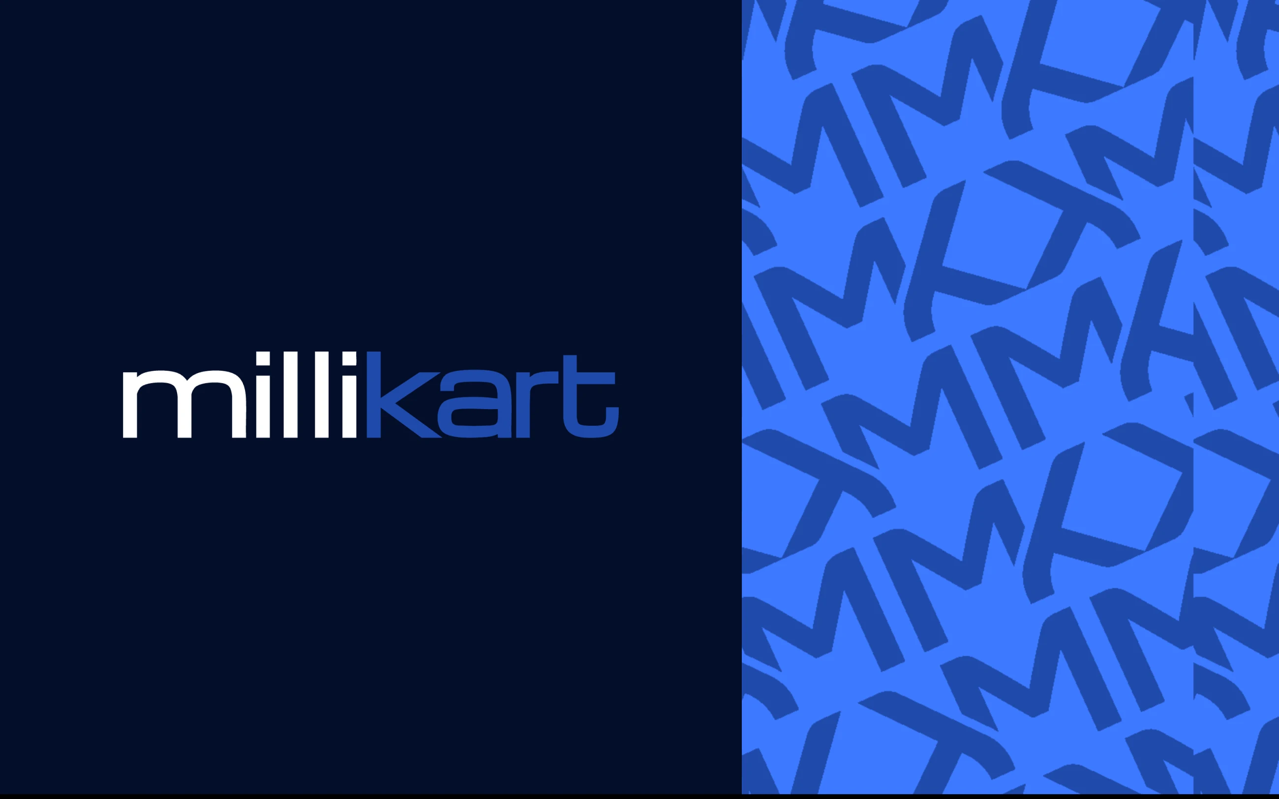
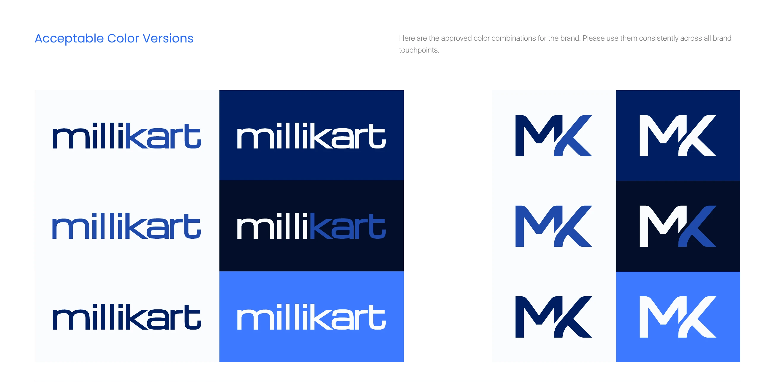
The wordmark and the MK monogram, each approved in six colour versions for light and dark backgrounds.
Navy for the wordmark, white for the monogram, solid blue for the pattern: the whole system on three cards.
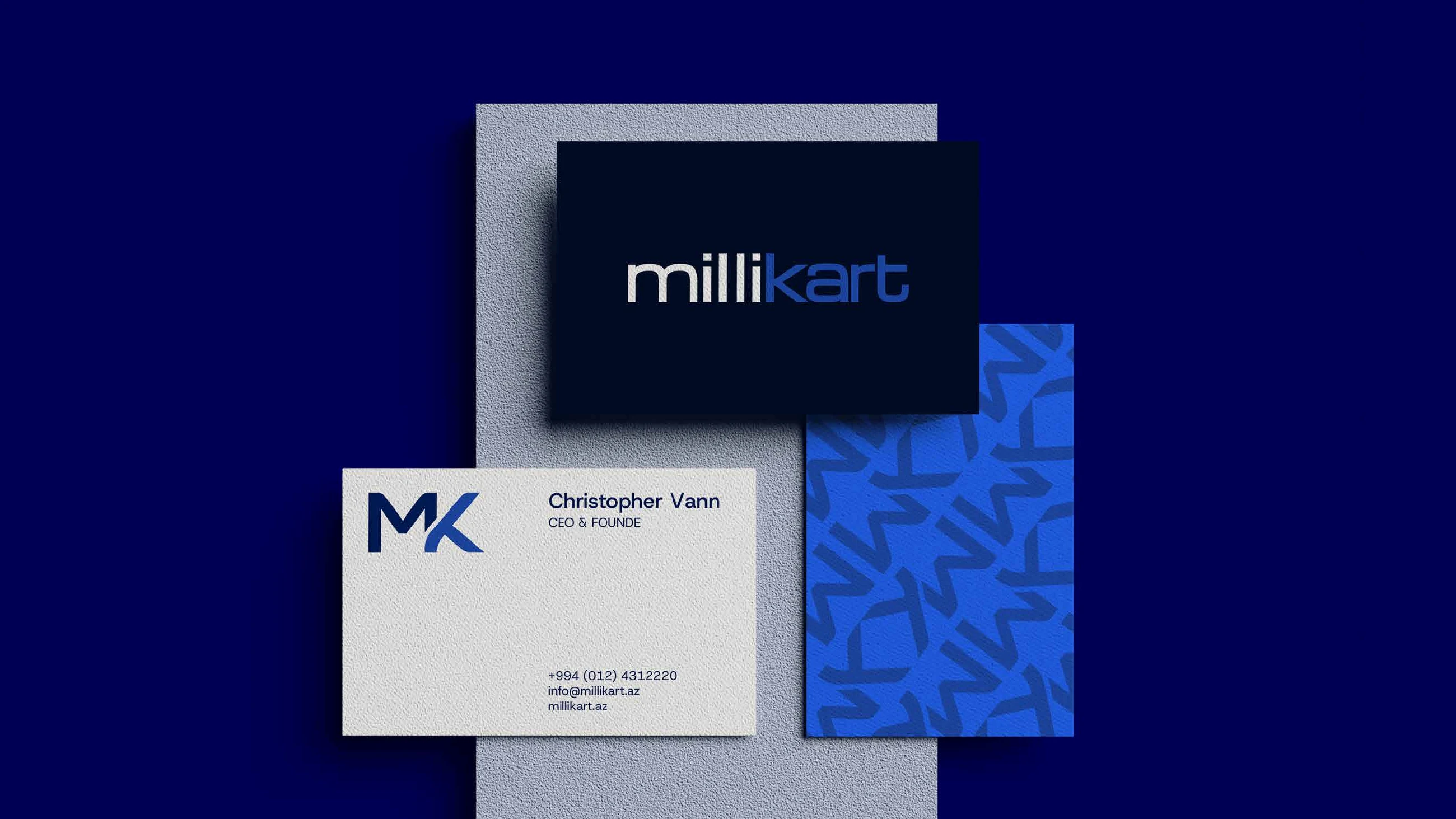
The M and the K, repeated and turned into one pattern that works in navy and in solid blue.

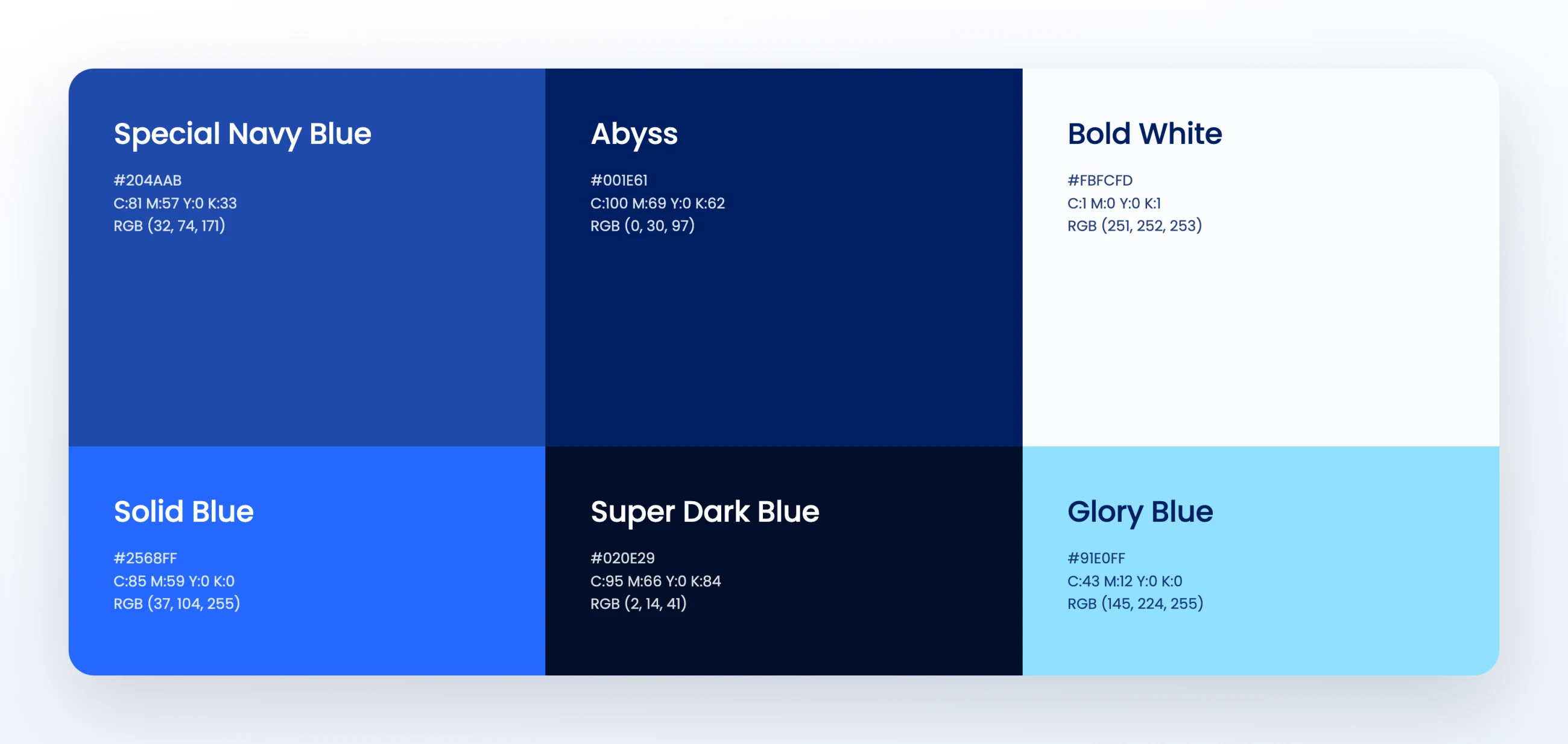
Special Navy Blue, Abyss, Solid Blue, Super Dark Blue and Glory Blue, with Bold White for paper and screens.
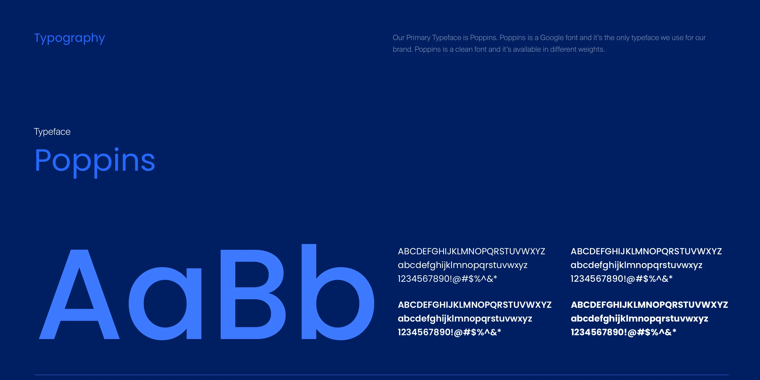
Poppins, in every weight, is the only typeface the brand uses.
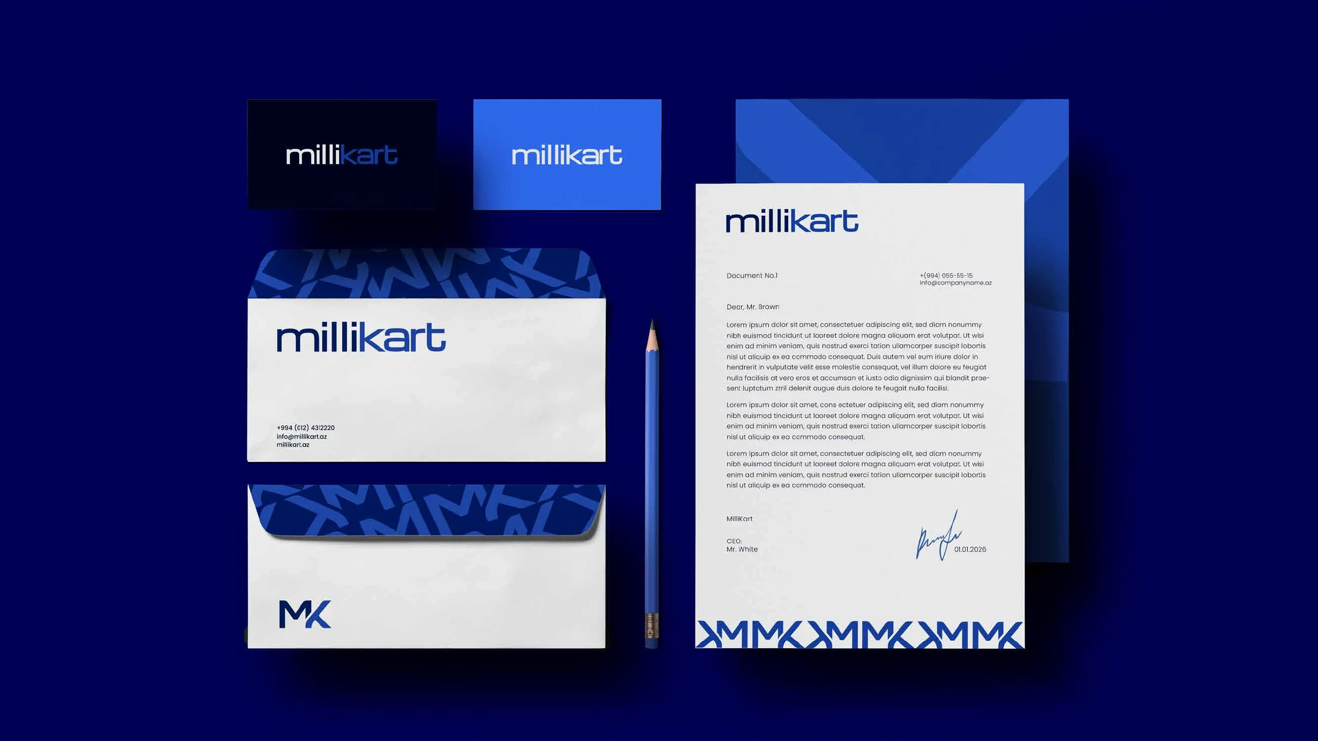
Letterhead, envelopes and cards, with the pattern inside the flap and the monogram running along the foot of the page.
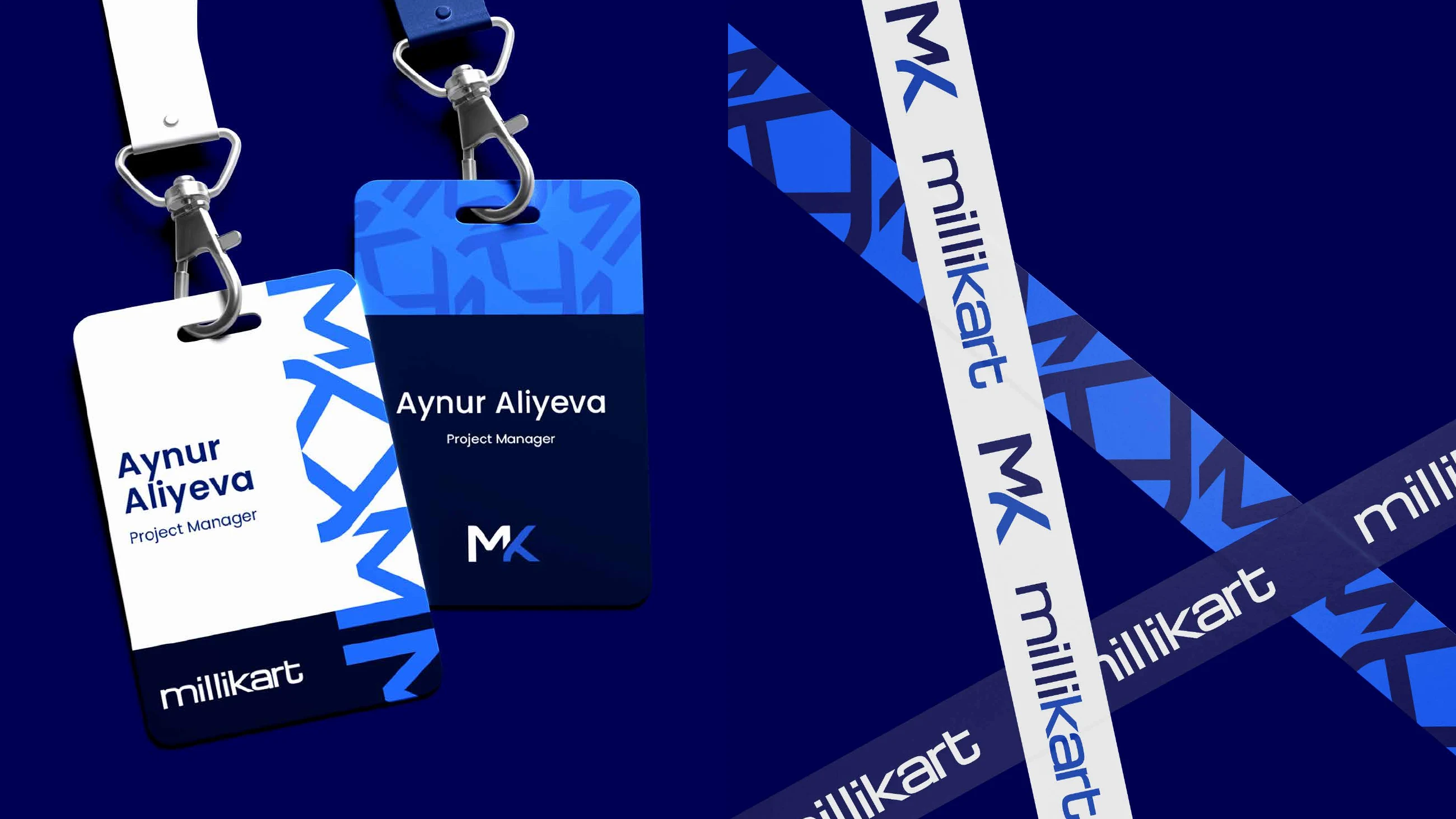
Staff badges and lanyards in white and navy, with the wordmark and the monogram running along the strap.
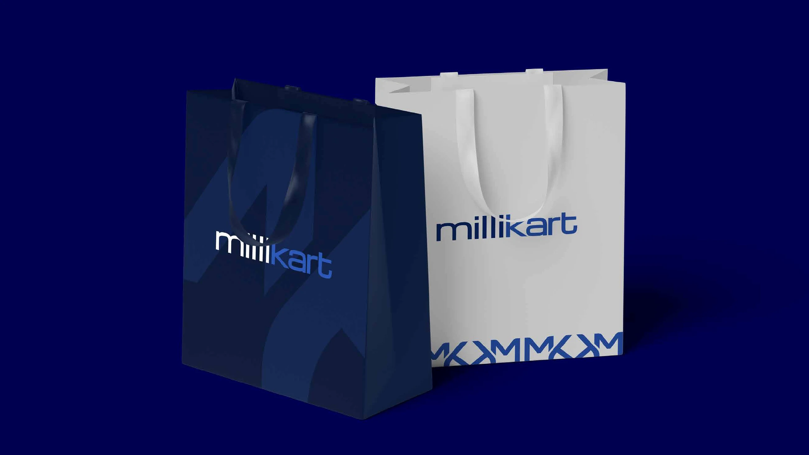
Shopping bags in navy and white, the wordmark on the front and the monogram band along the bottom.
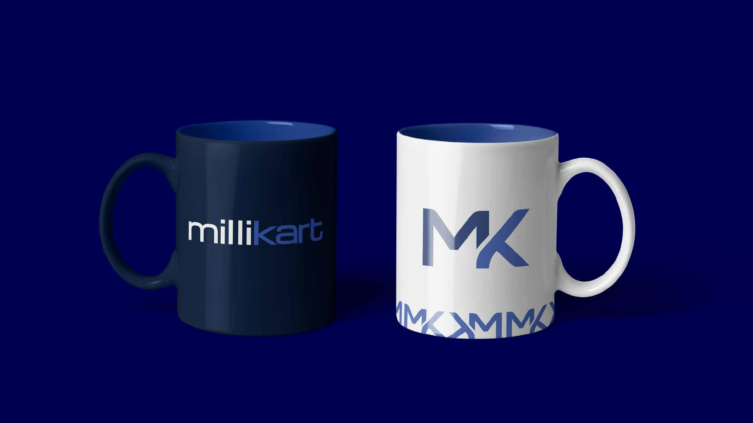
The wordmark on navy, the monogram on white.
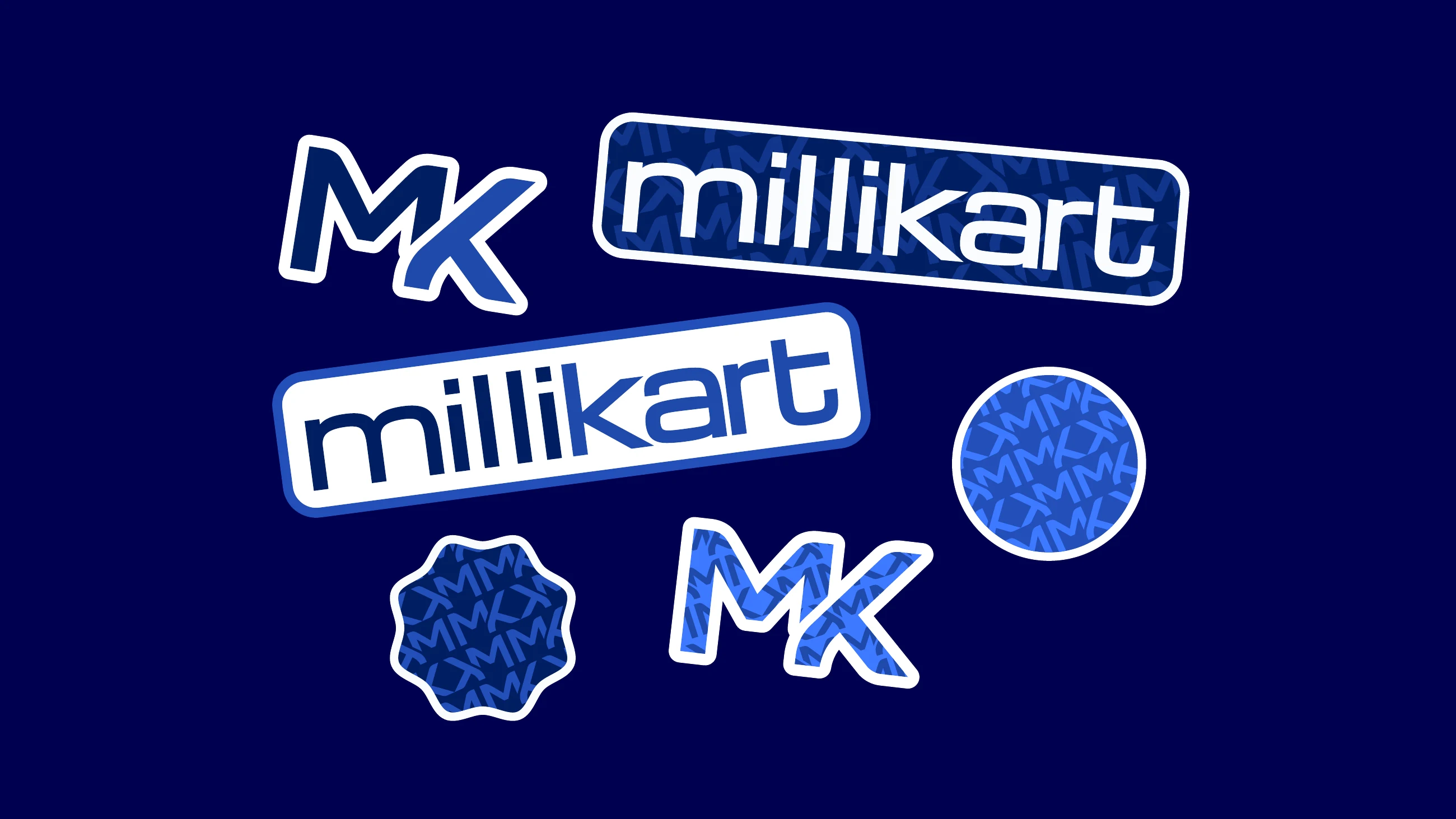
The wordmark, the monogram and the pattern, cut as stickers.
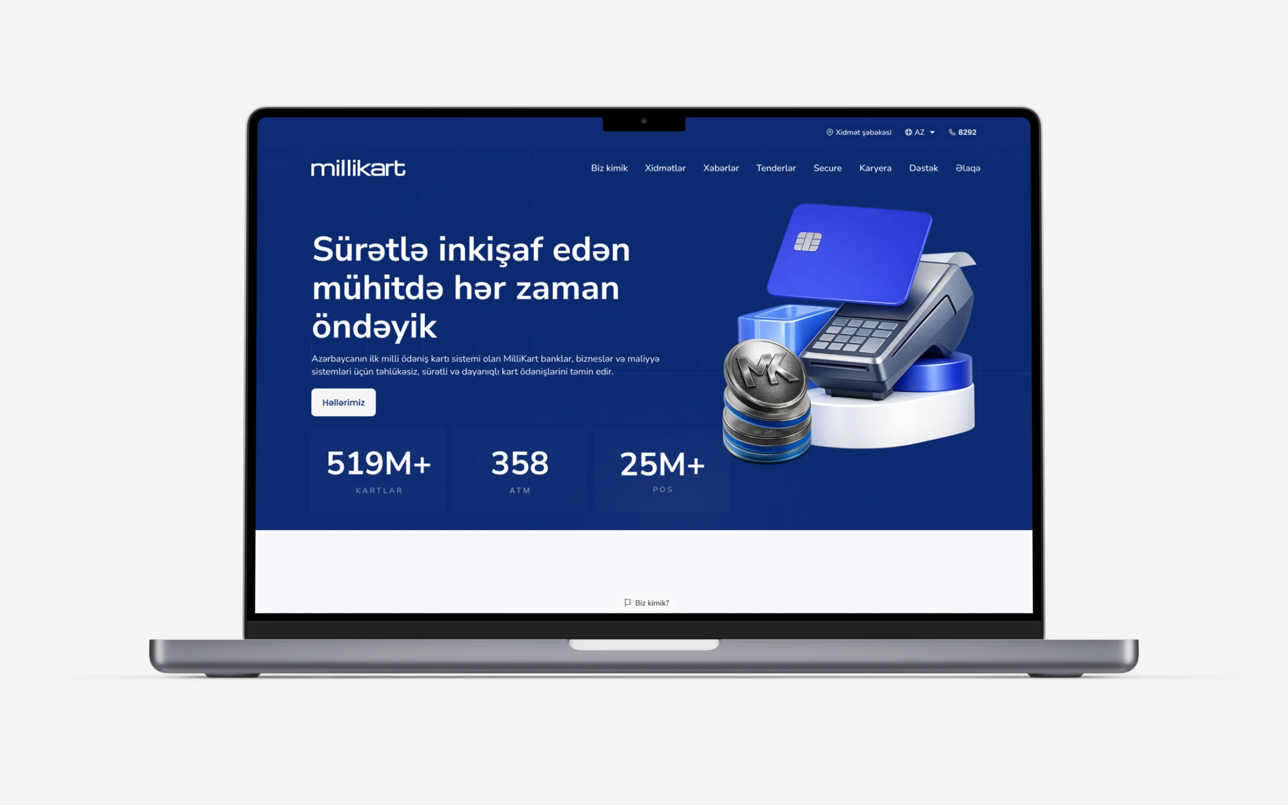
The website carries the same blues: a navy first screen, the monogram on a coin and the essentials before the first scroll.
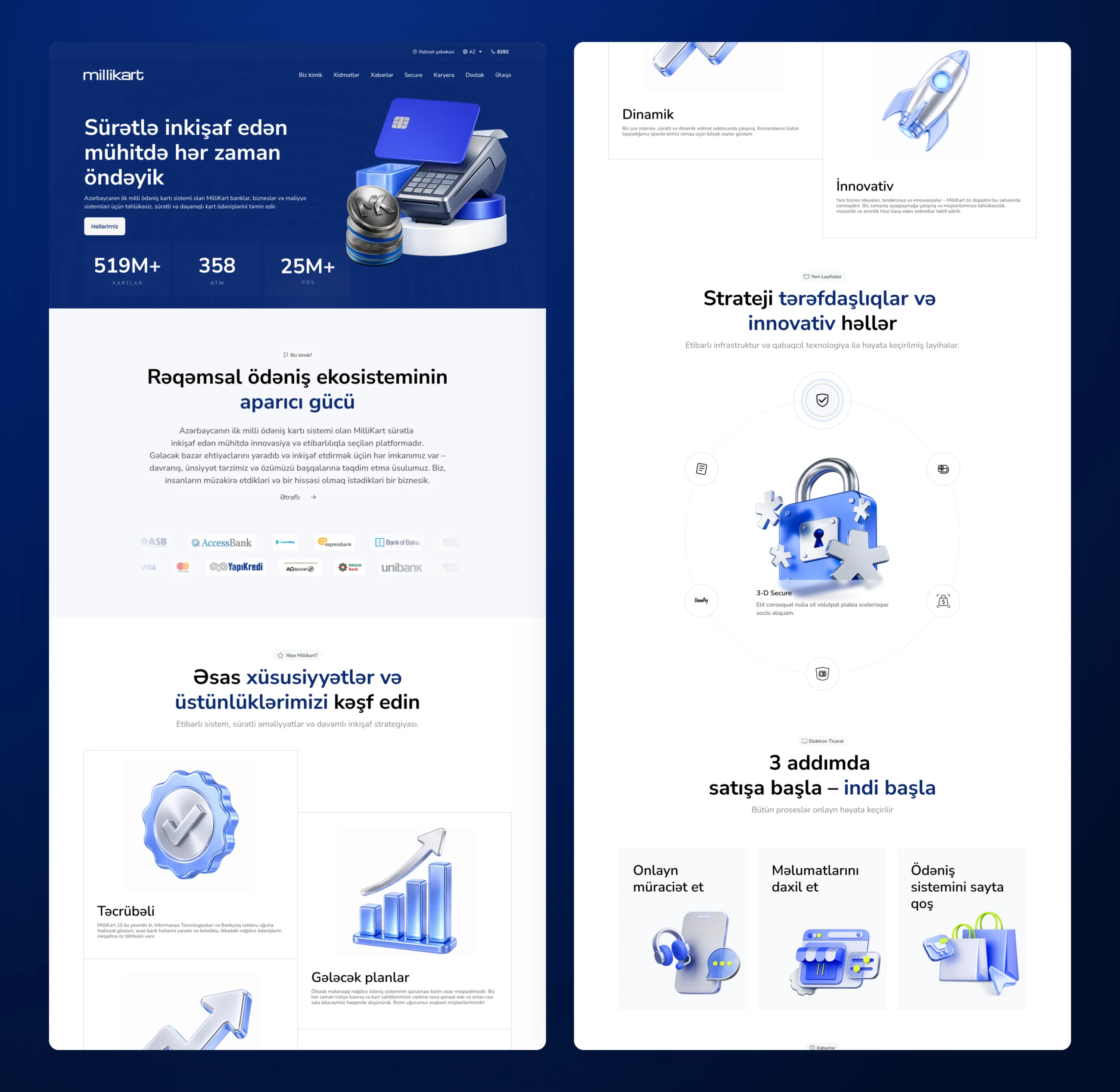
The payment ecosystem, partner banks, features, strategic partnerships and a three step start for merchants.
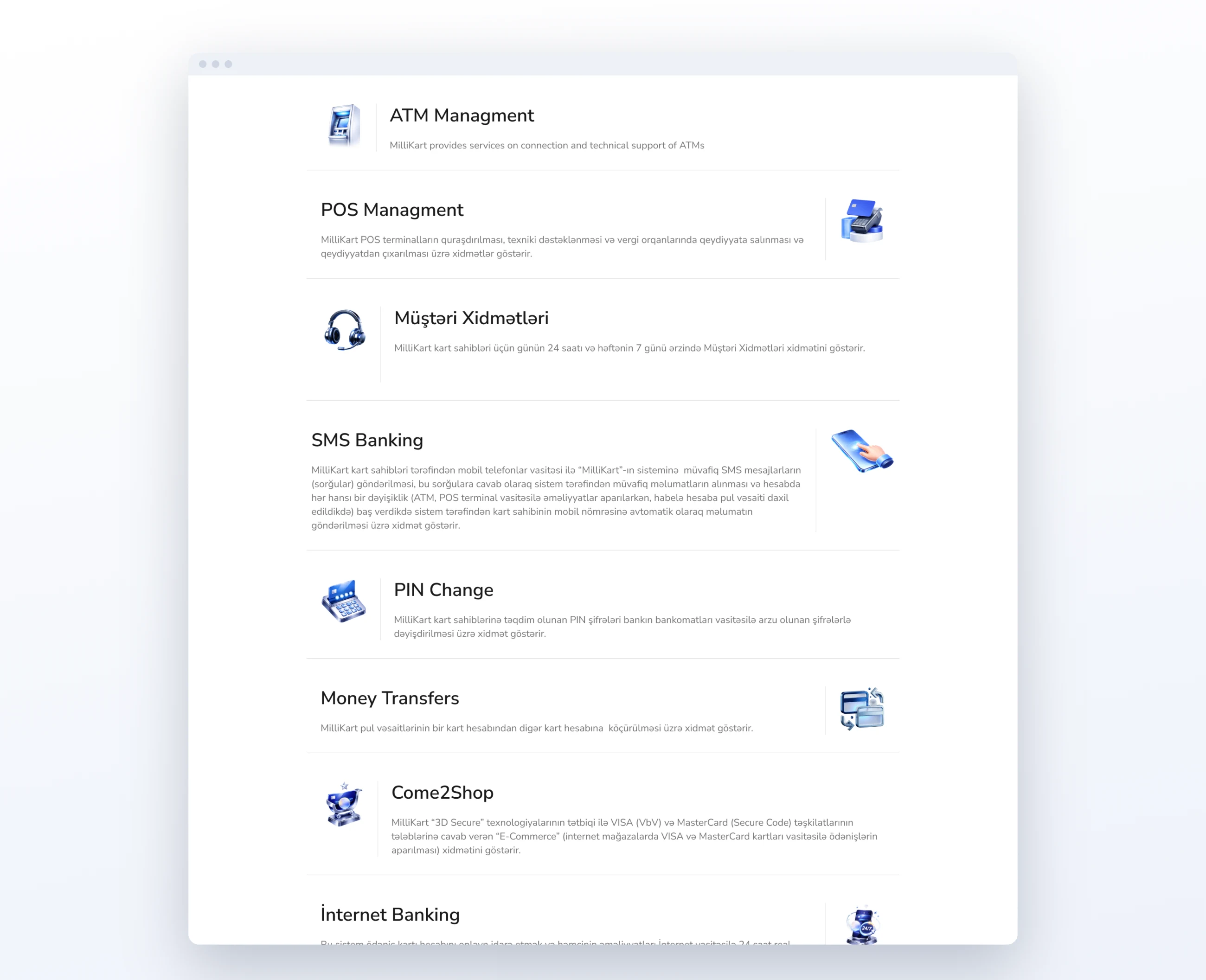
ATM and POS management, customer service, SMS banking, PIN change, money transfers, 3D Secure online payments and internet banking.
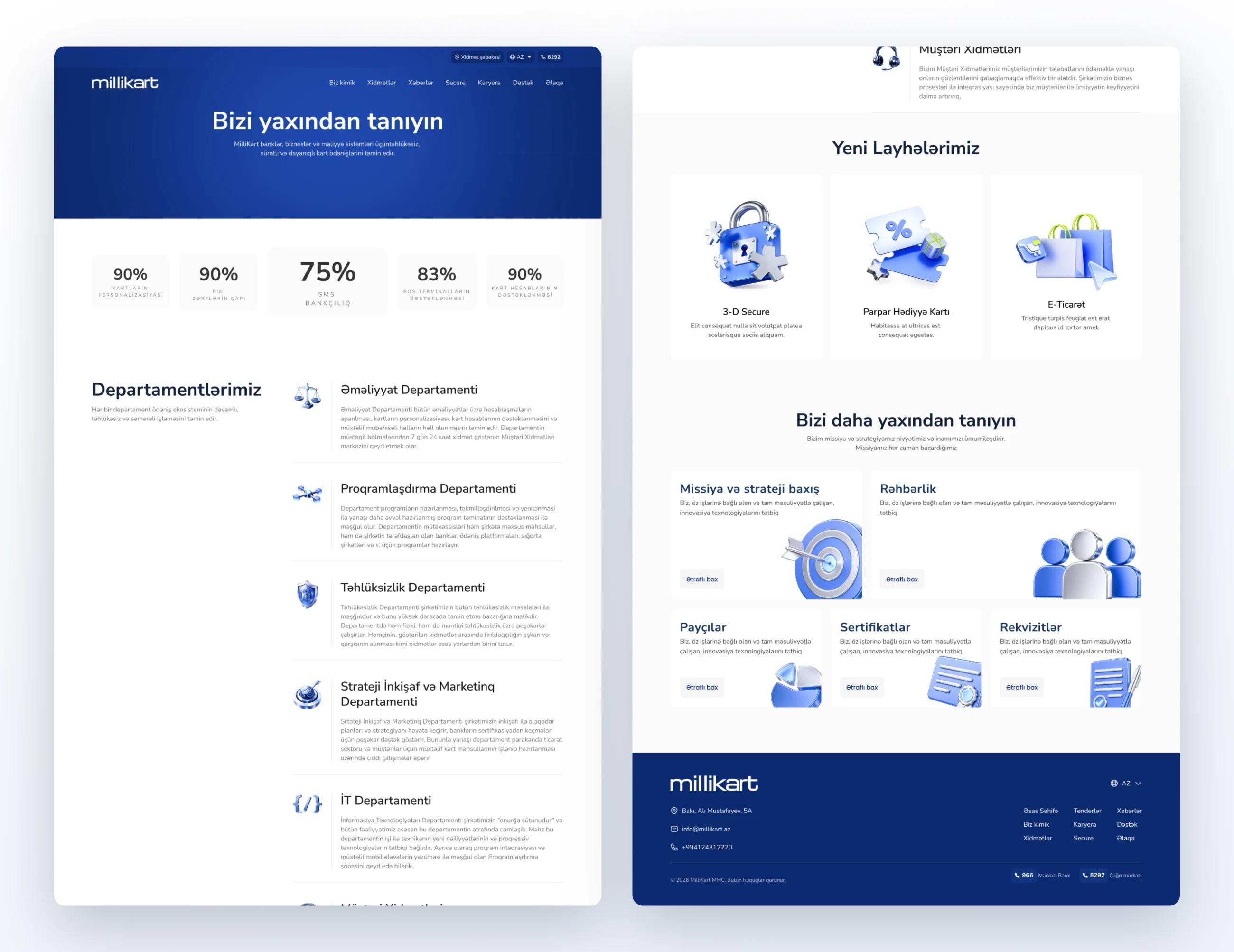
An about page that introduces every department, from operations and software to security and customer service, then the new projects and the company.
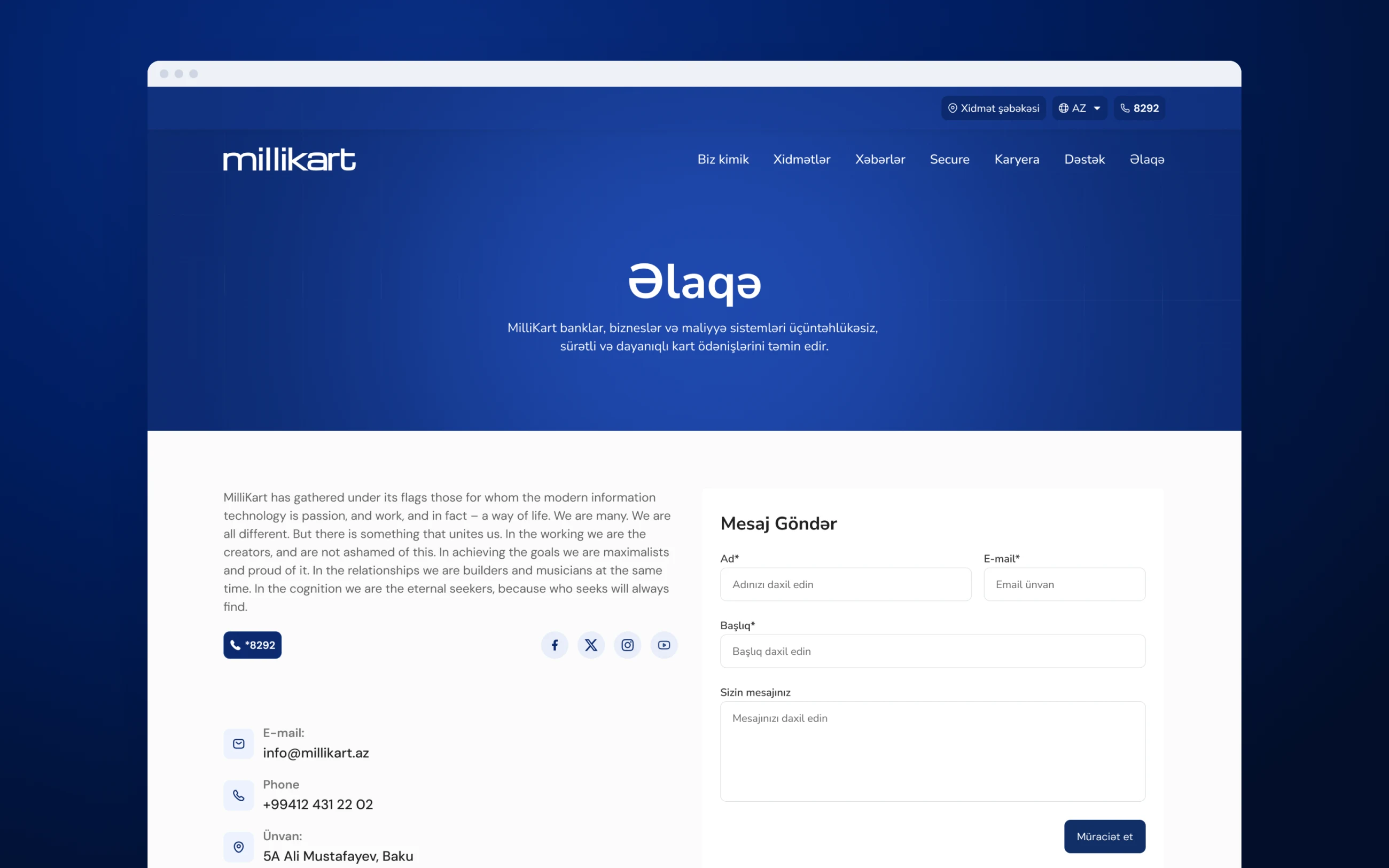
The hotline, e-mail and address next to a message form, with the office on a map below.

Yalnız saytın işləməsi üçün lazım olanları saxlayırıq. İcazə versəniz, saytı yaxşılaşdırmaq üçün ondan necə istifadə edildiyini də ölçmək istərdik. Kuki siyasətini oxuyun.