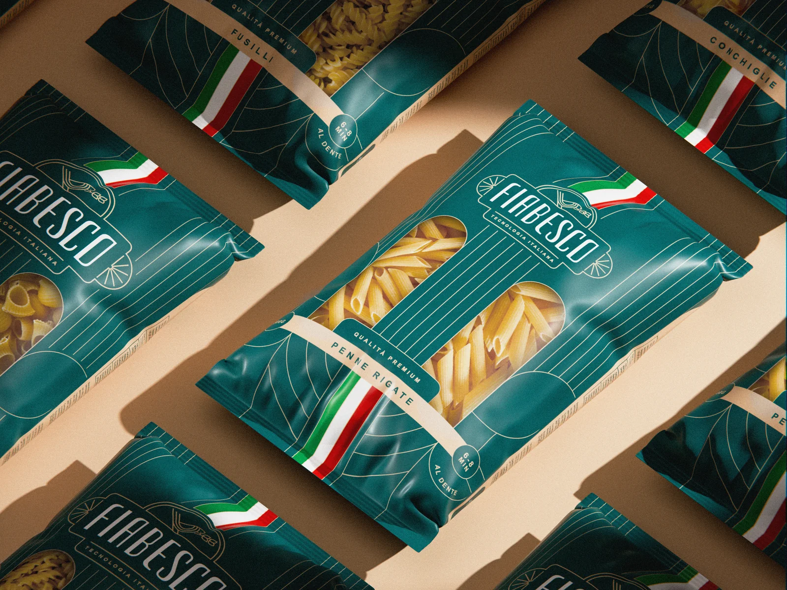
Fiabesco ↗
Упаковка / Identity / Packaging
Since 1974, Kaşıbeyaz has carried the kebab and baklava of Gaziantep from Turkey to Iran, Qatar and the UAE. For its restaurant in Baku we built a brand system that feels as careful as the kitchen: a quiet serif logotype, a K drawn into a pattern, wine red and mallard green, and one language from the table to the takeaway box.
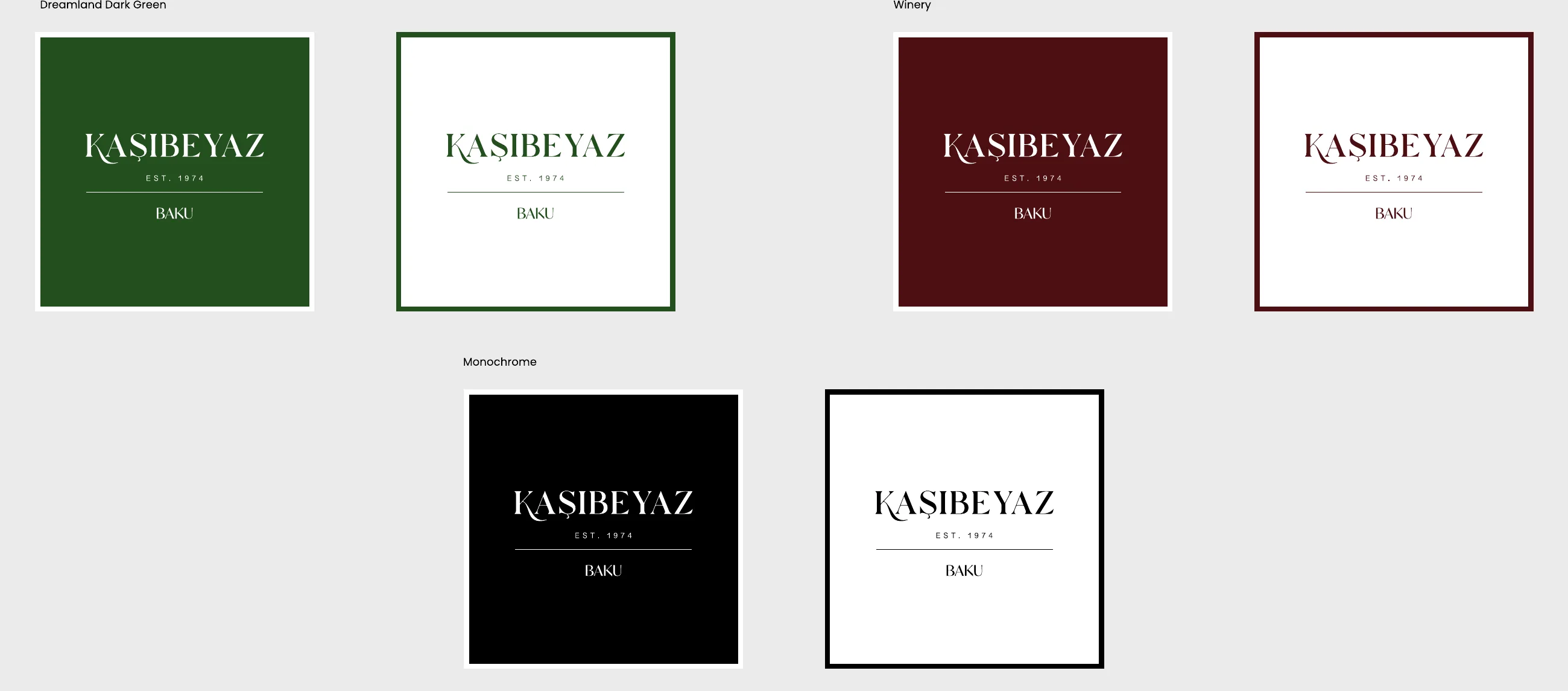
A refined serif logotype with EST. 1974 and Baku beneath it, in mallard green and wine red first, black and white when colour is not possible.
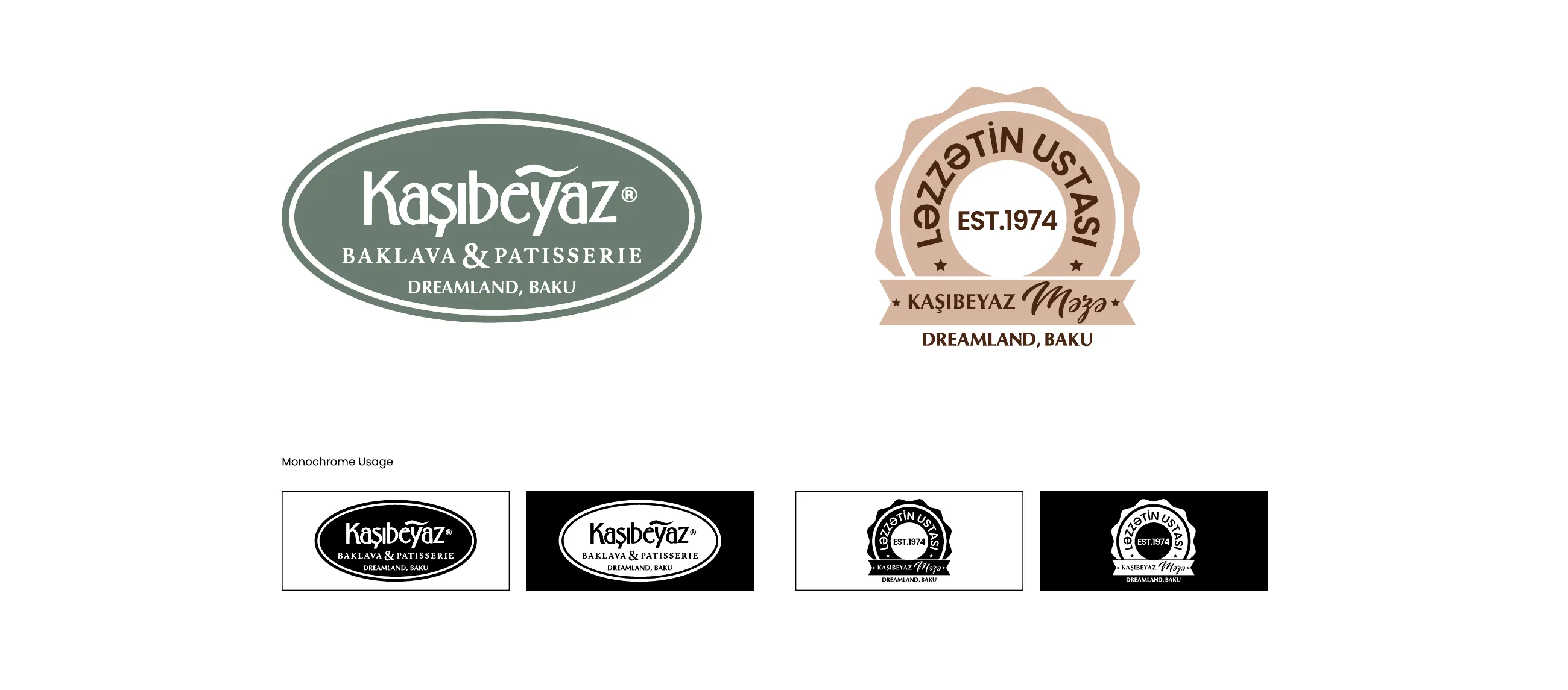
The patisserie and the master's seal sit beside the main logo, each with its own mono version.
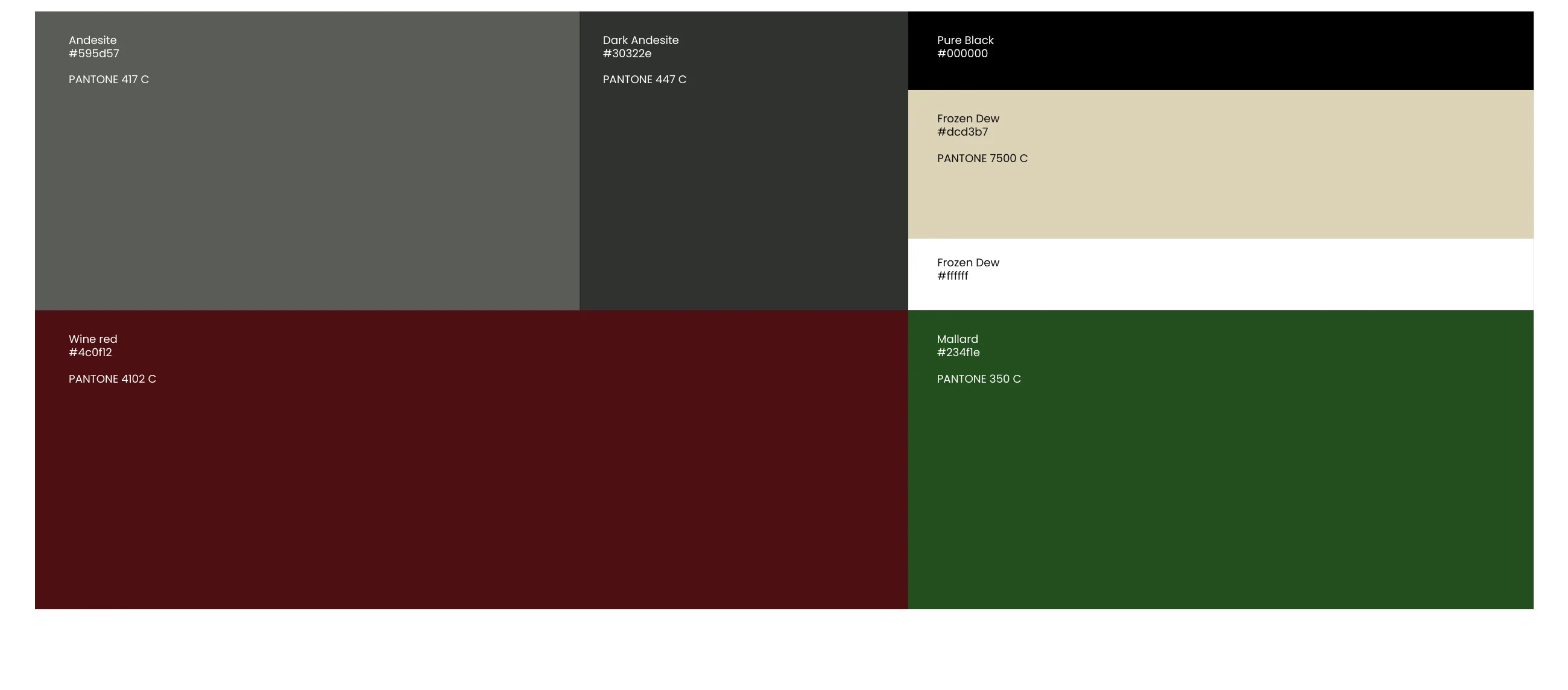
Andesite and Dark Andesite for the base, Frozen Dew for warmth, Wine Red and Mallard for the brand's two moods.
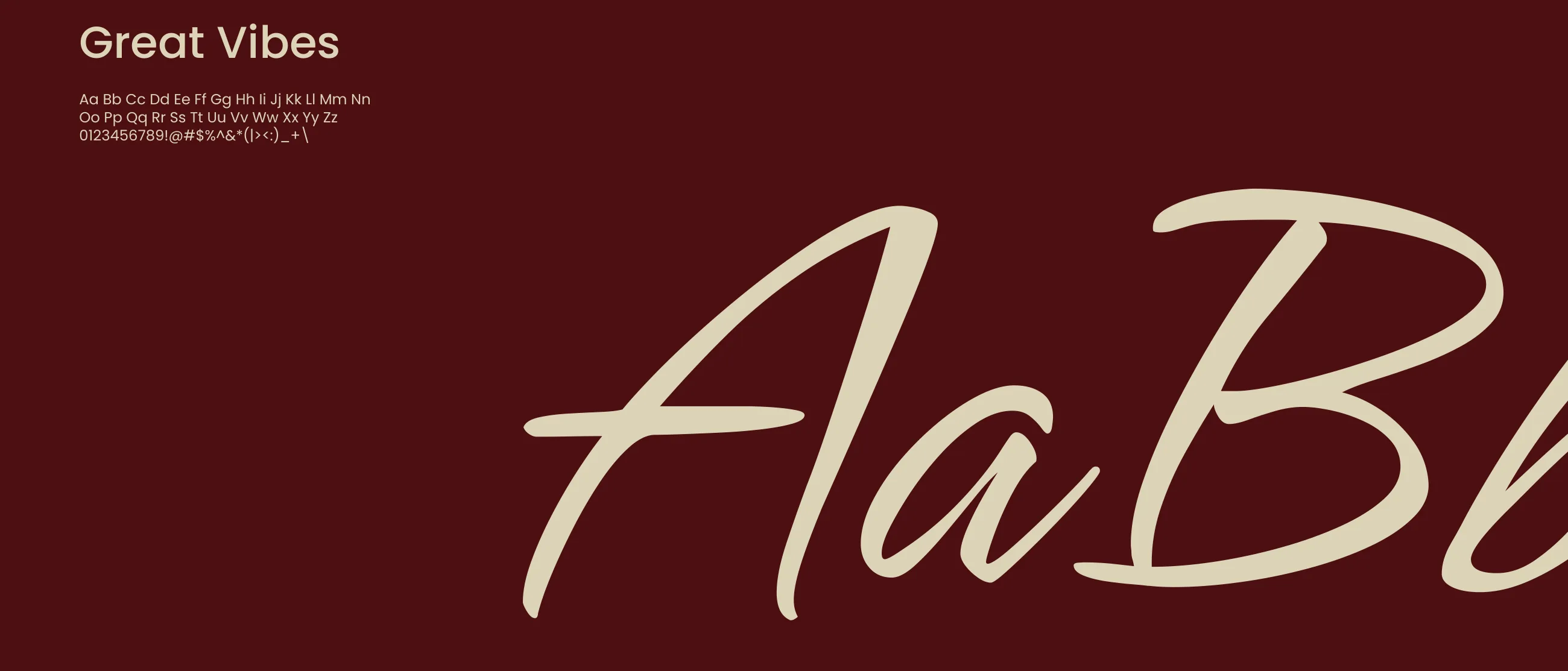
Poppins carries every piece of information. Great Vibes is kept for short, handwritten lines.
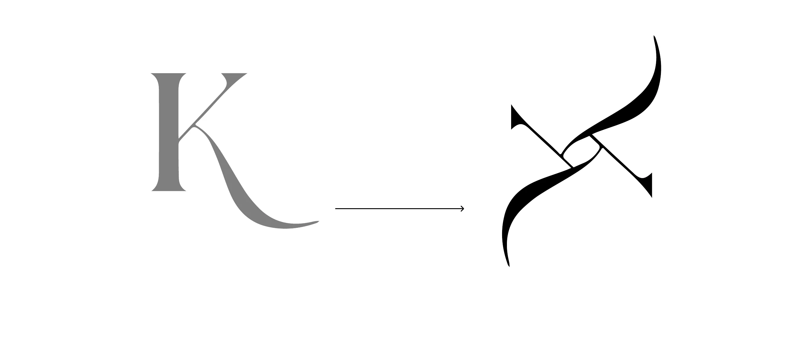
A figure from the logo, simplified into a layered ribbon that works as a pattern or on its own.
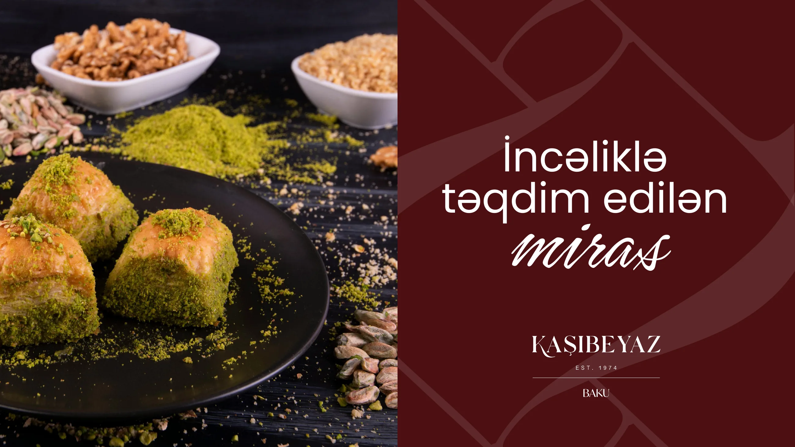
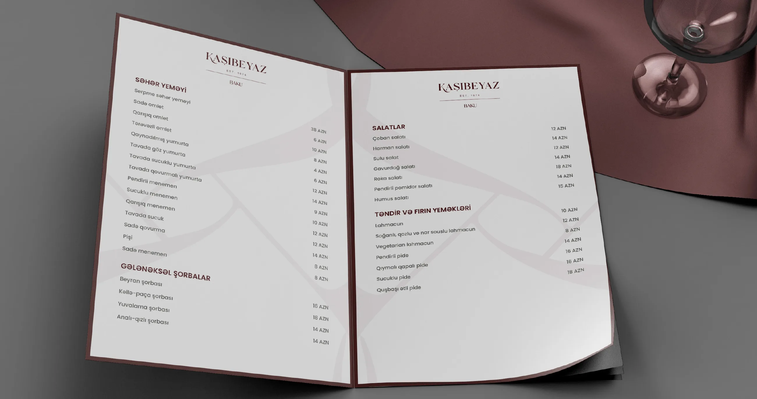
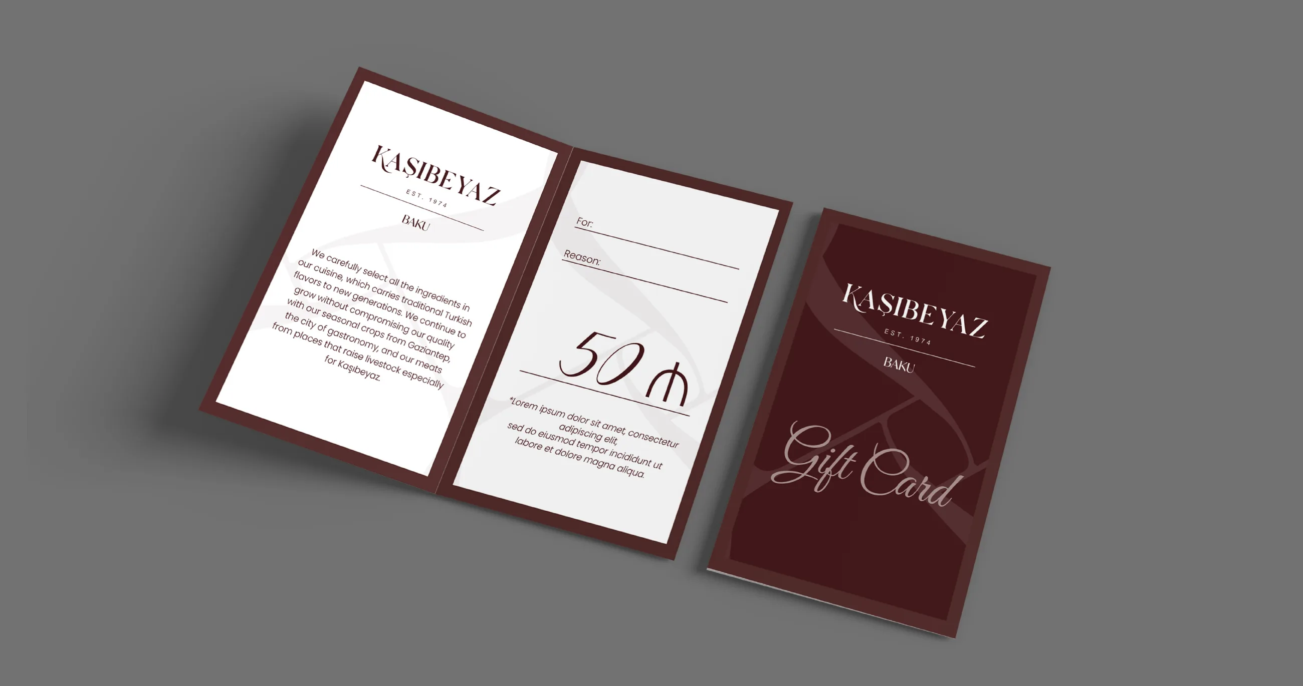
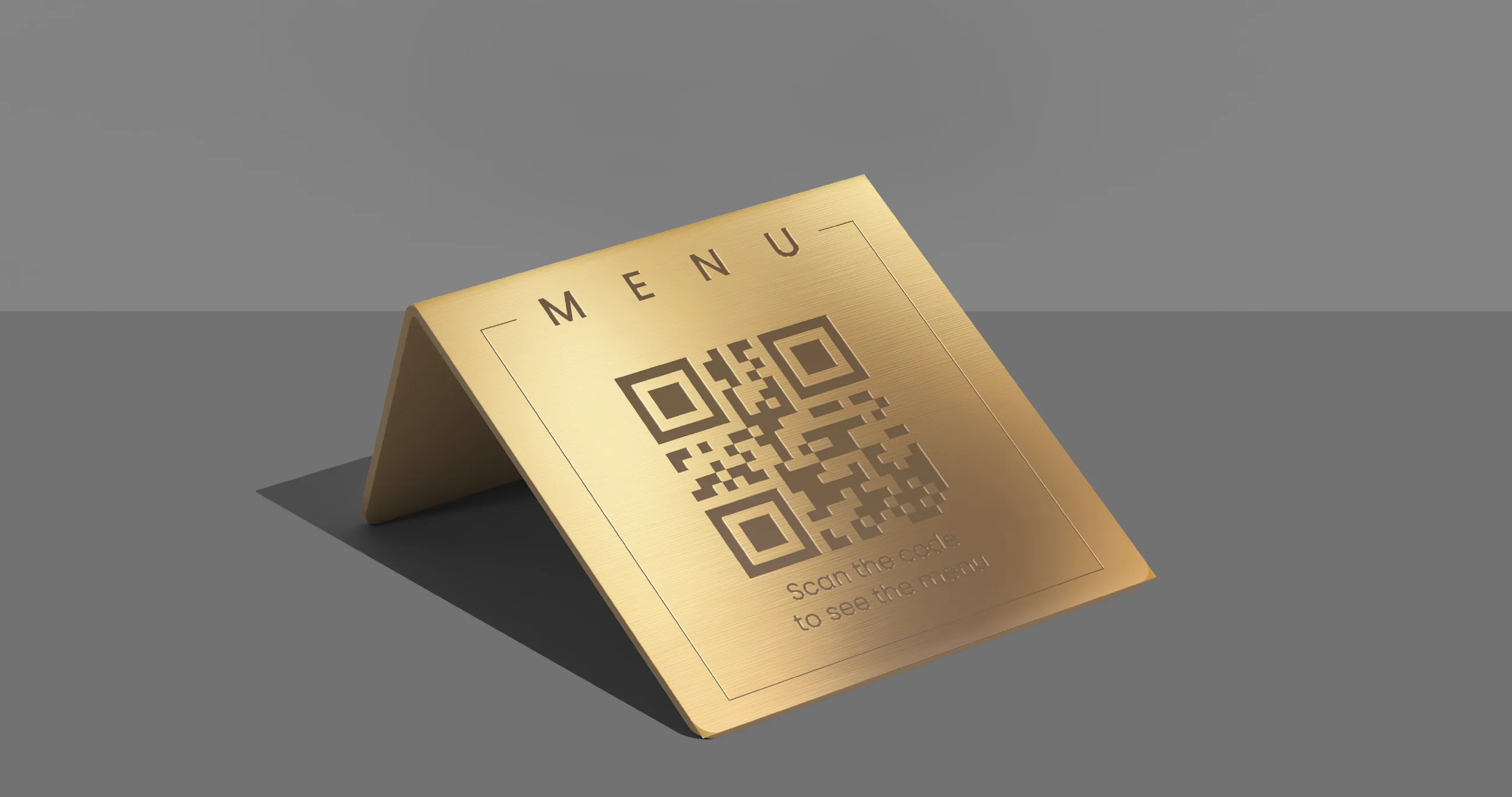
The menu, the gift card and a gold table tent with a QR code.
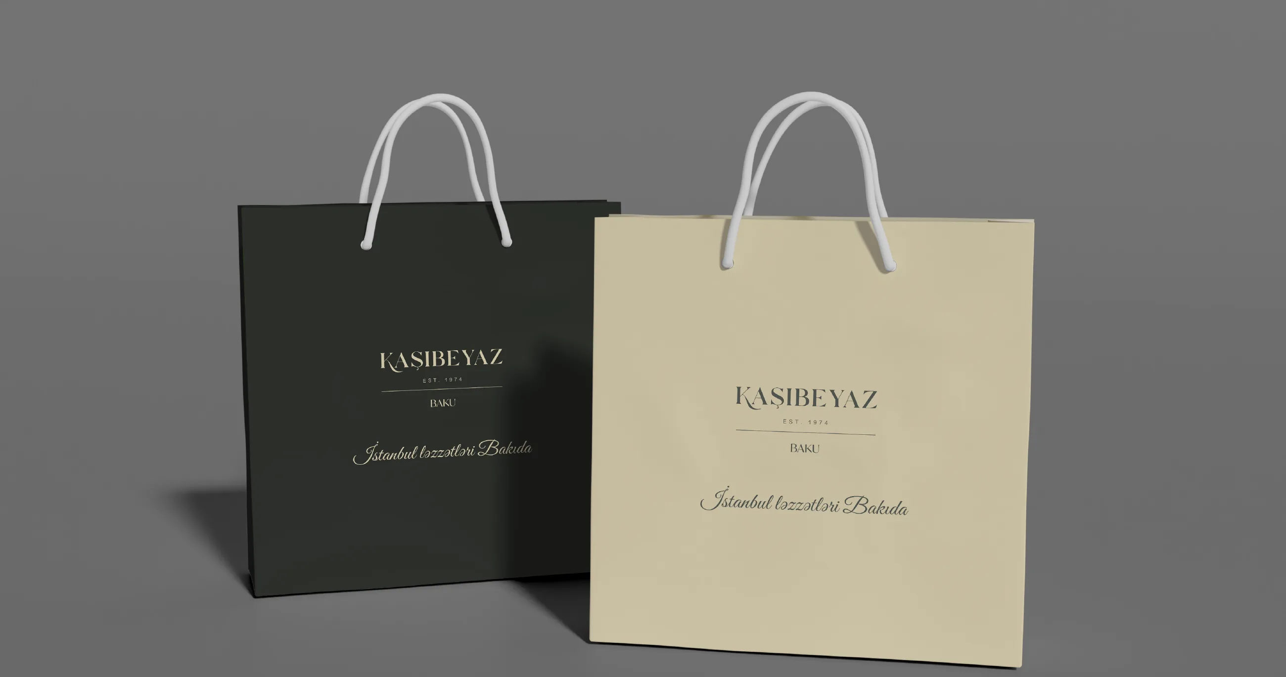
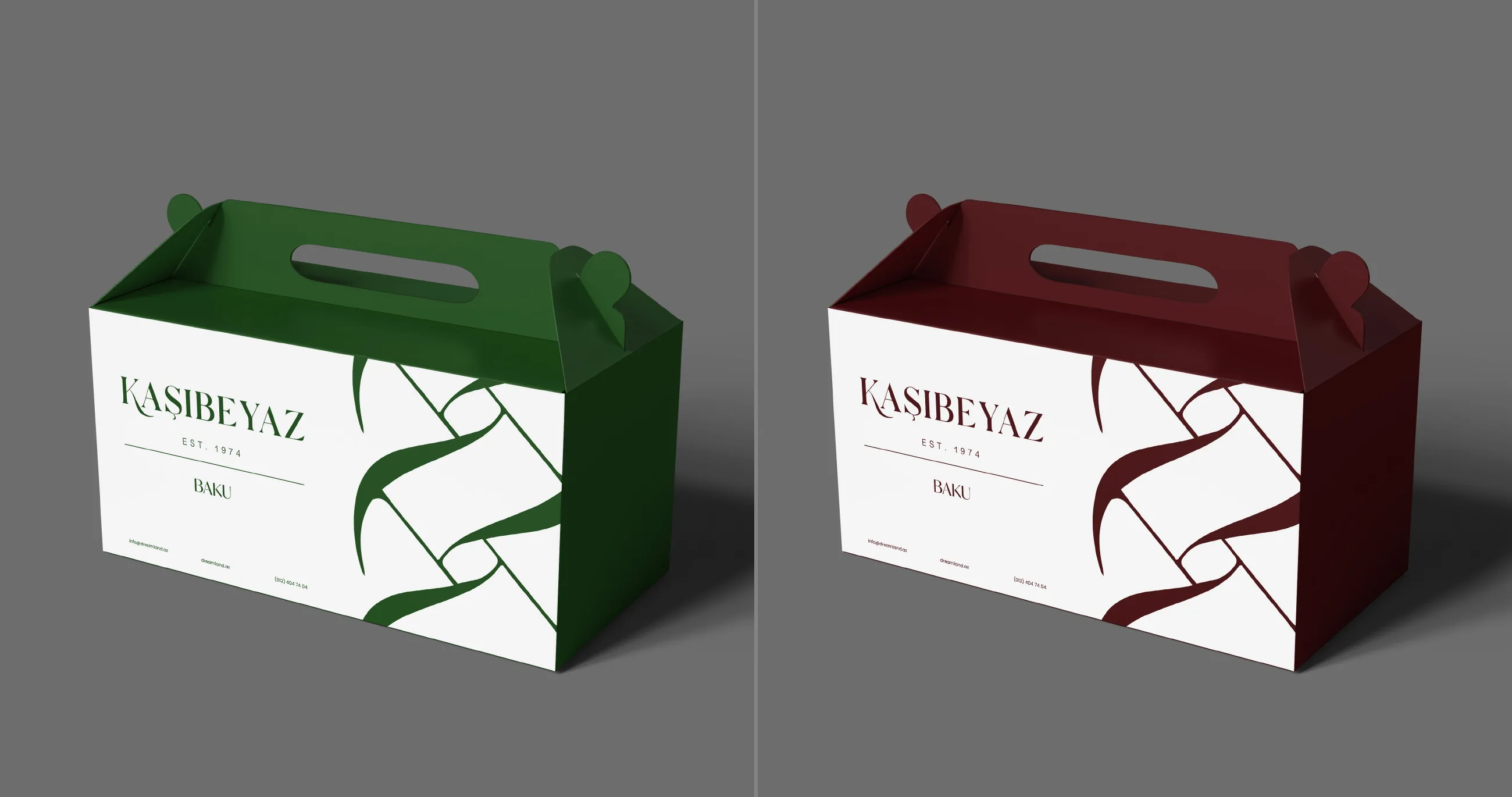
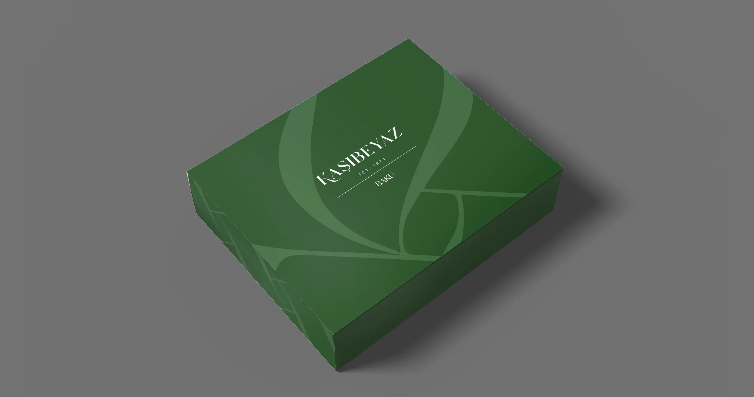
Bags, boxes and a pide and baklava box, with the ribbon pattern in green and wine red.
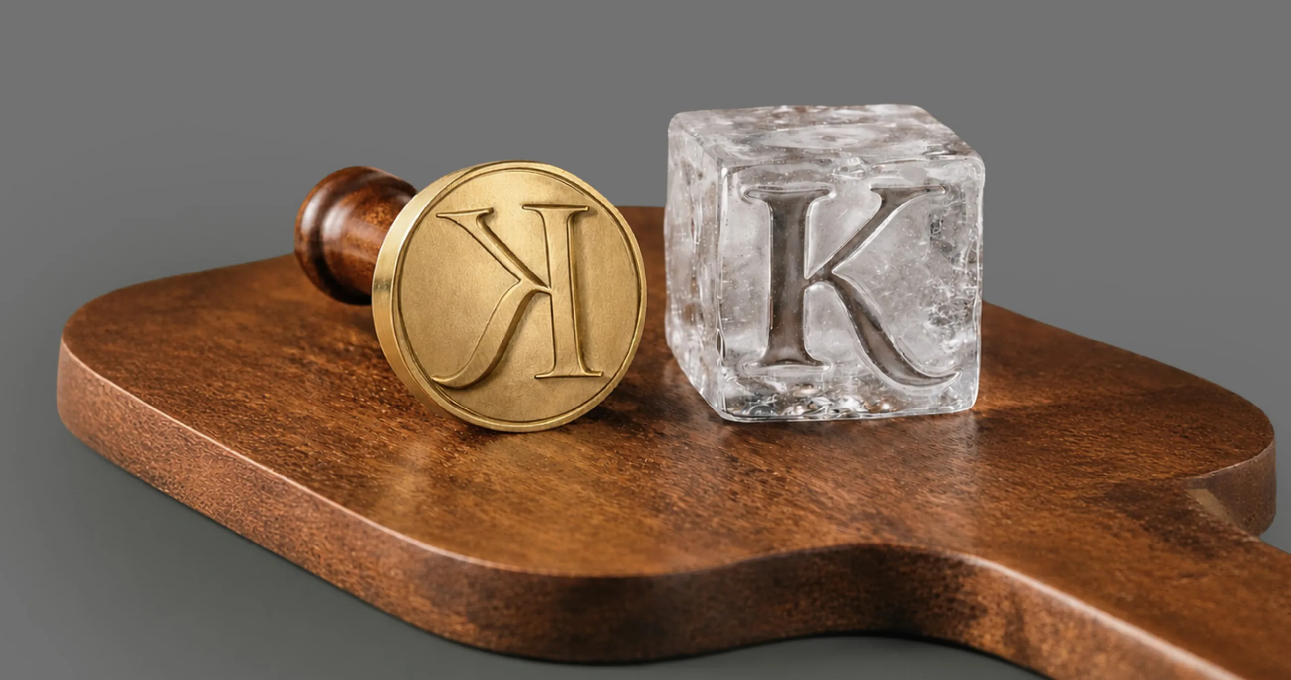
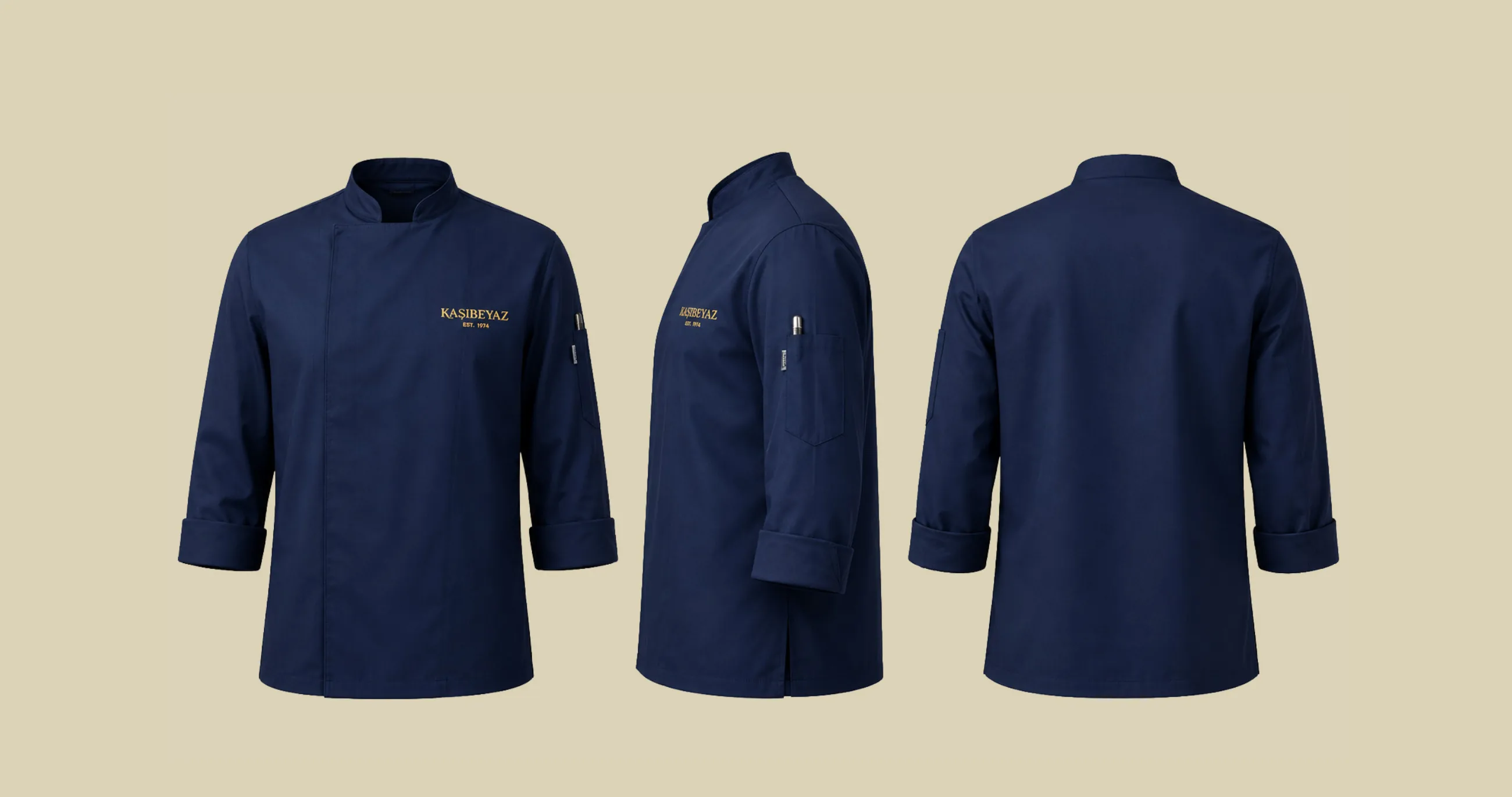
A brass stamp that presses the K into ice, and uniforms for the kitchen and the floor.
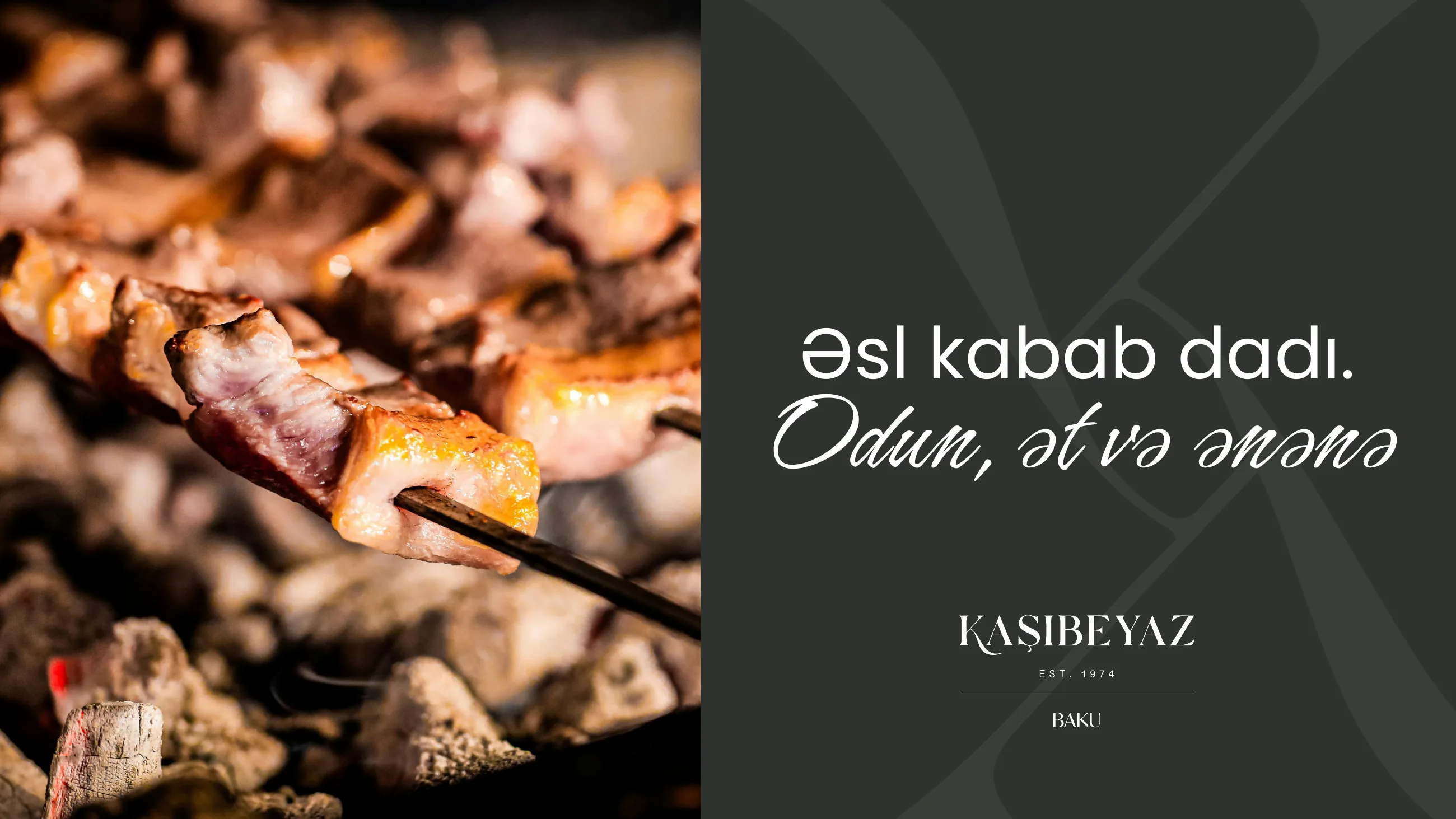
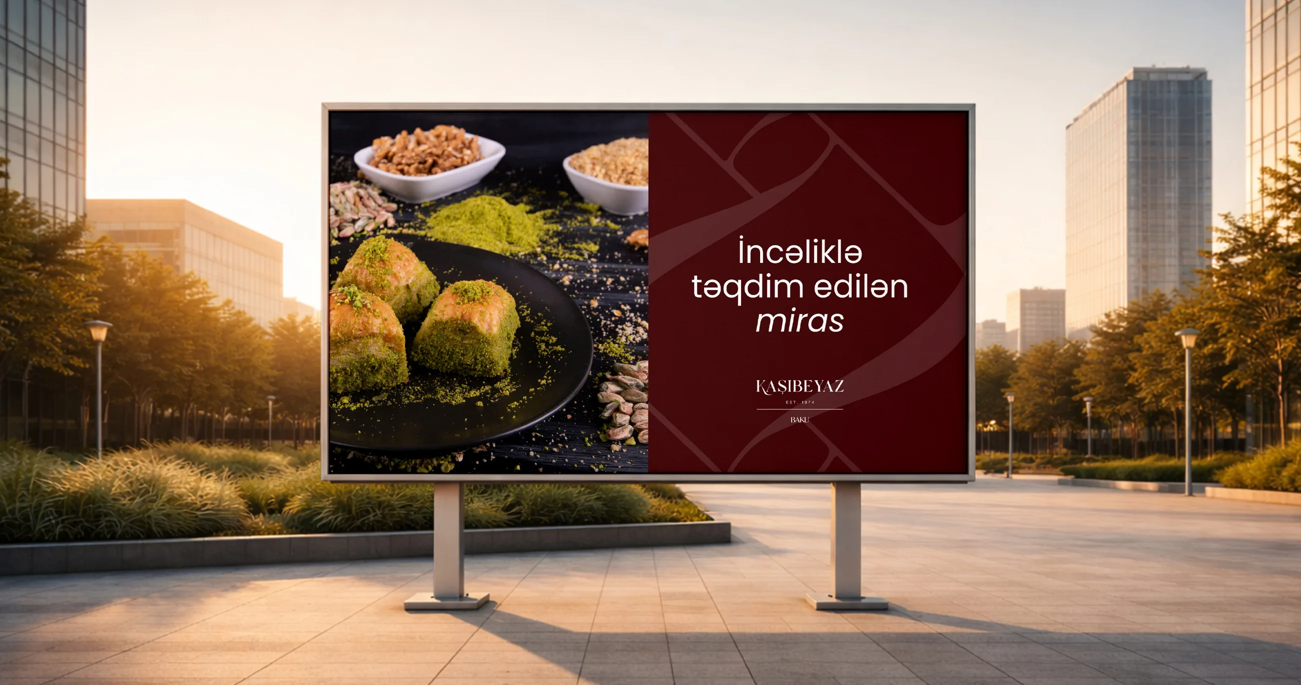
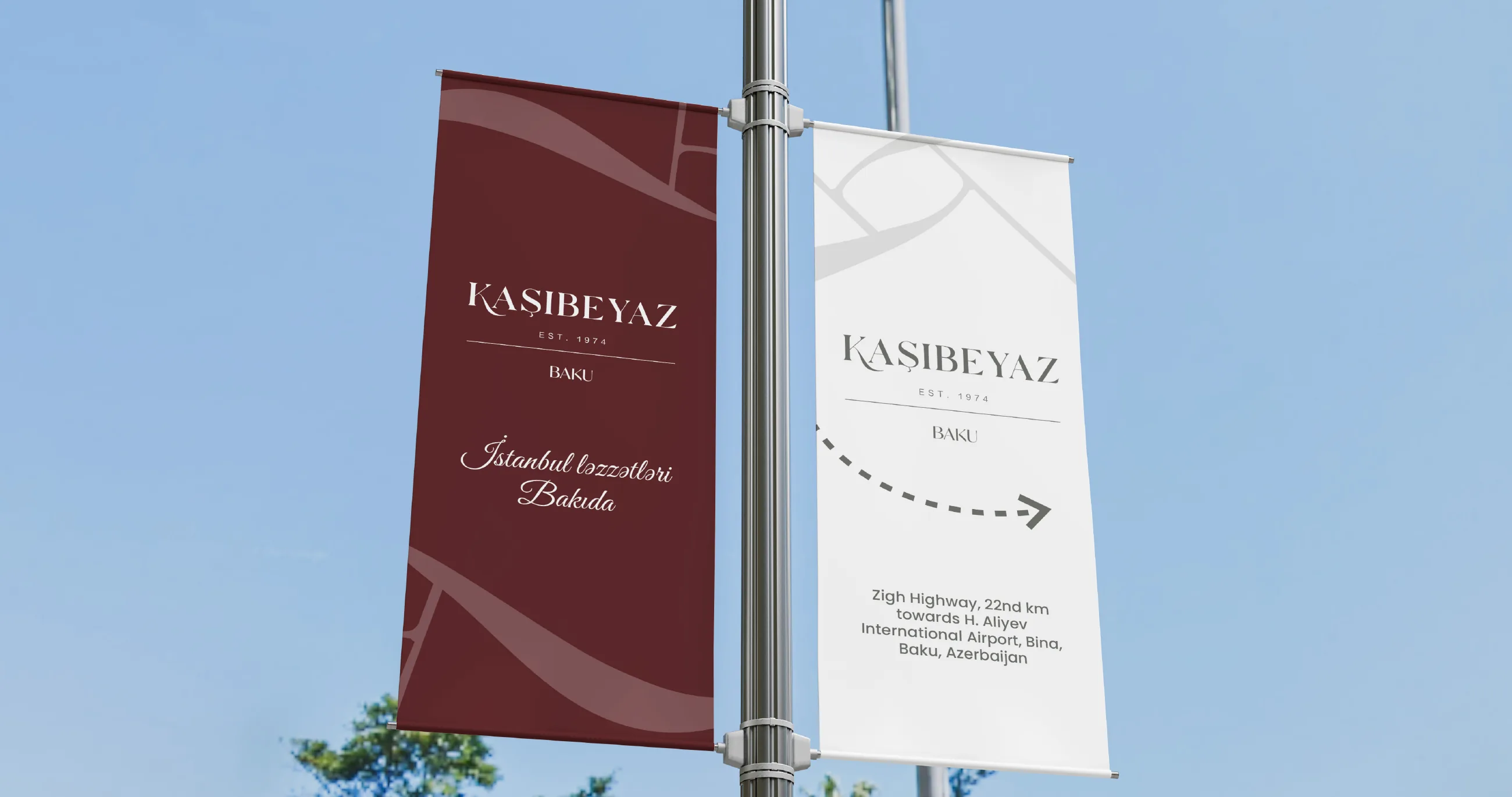
Billboards and pole banners carry the same photography, script and wine red.
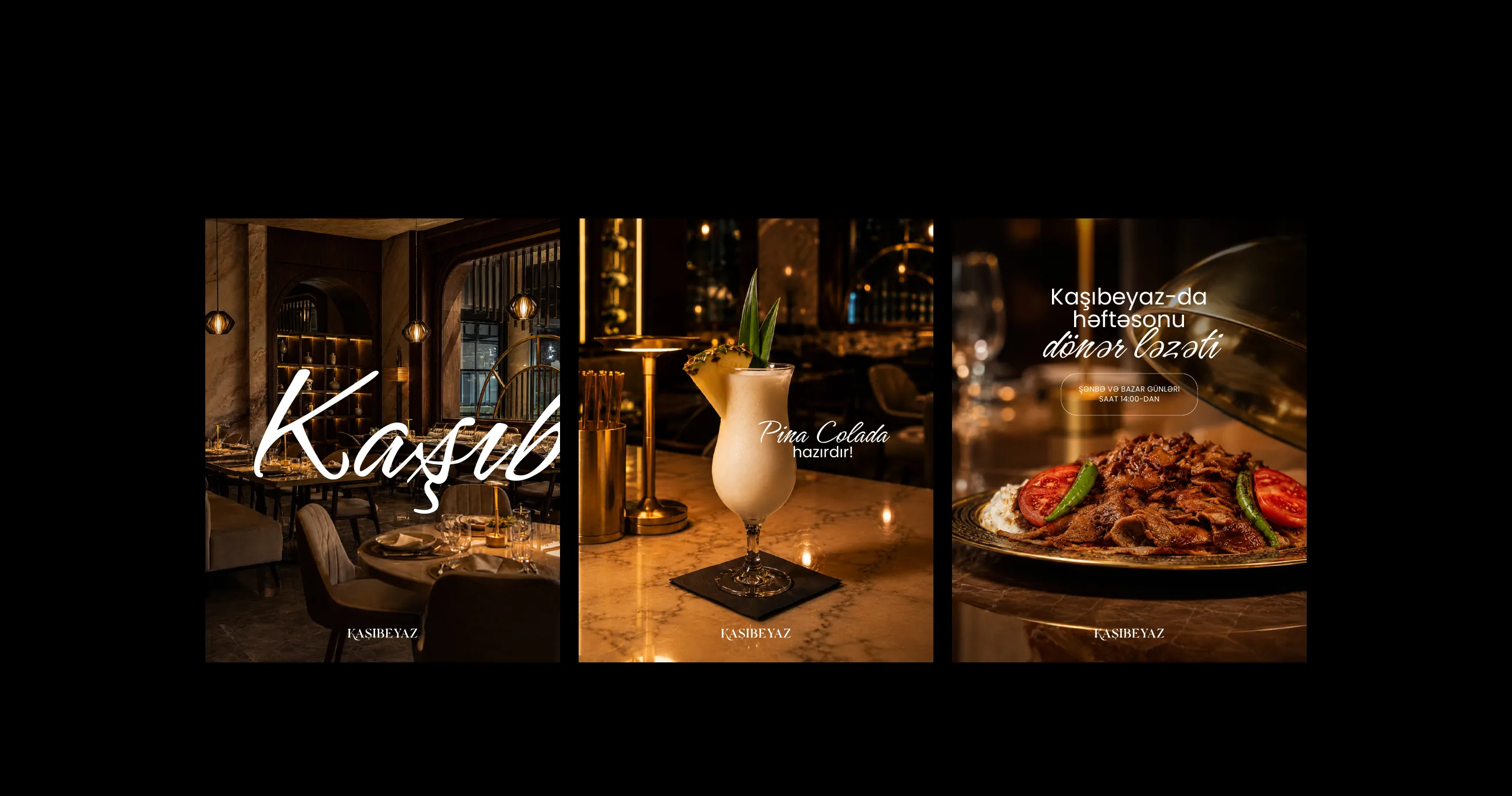
Posts built on warm, low-light photography and the script, in Azerbaijani.
Мы сохраняем только то, что нужно для работы сайта. С вашего разрешения мы также хотели бы измерять, как используется сайт, чтобы делать его лучше. Политика cookie.